Commencis · DenizBank
A banking app that starts from your life, not the product list
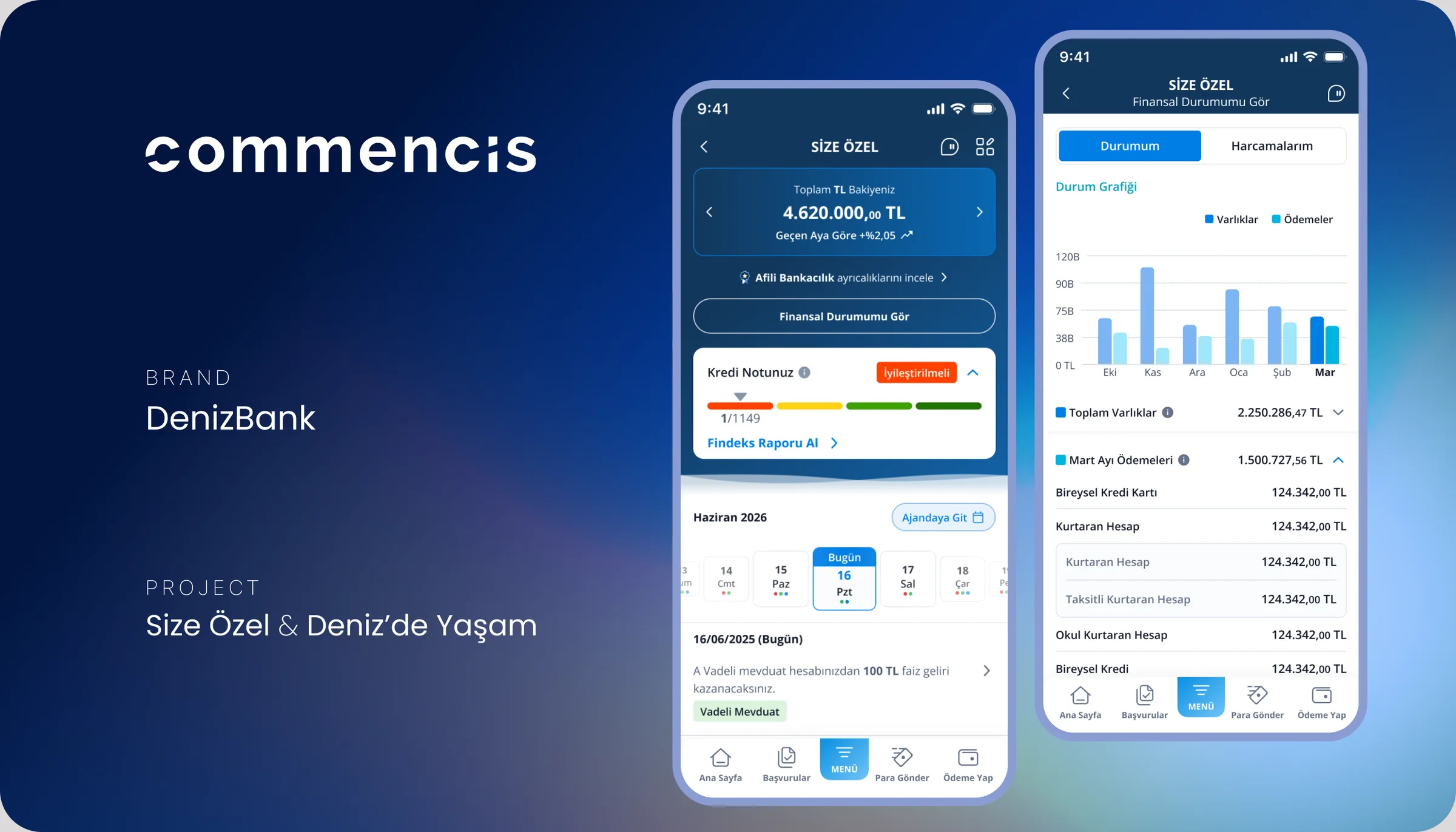
The complete UI of two MobilDeniz features: Size Özel (“Just for You”) and Deniz’de Yaşam (“Life with Deniz”).
Overview
People think about their life, not their products.
Banking apps are organized by product: accounts, cards, loans. People think about their life: their home, their car, what’s due next.
At Commencis, I designed the complete UI of two MobilDeniz features that start from the customer instead: Size Özel (“Just for You”) and Deniz’de Yaşam (“Life with Deniz”).
Business goal
- Start the app from the customer, not the product list.
- Show each customer their own financial picture and next steps on one screen.
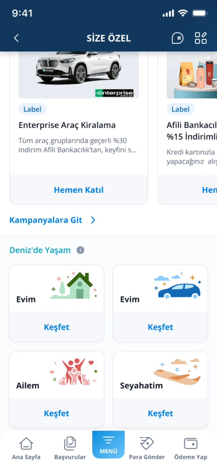
- Group everyday banking around Home, Car, Family and Travel.
- Present offers in a way that feels relevant, not pushy.
User goal
- See my balance, credit score and what’s coming up at a glance.
- Shape my home screen around the shortcuts I use.
- Find everything about my home, car, family or trips in one place.
- Get reminded before insurance or other dates expire.
Size Özel · Home screen
Your finances, what’s coming up, then offers.
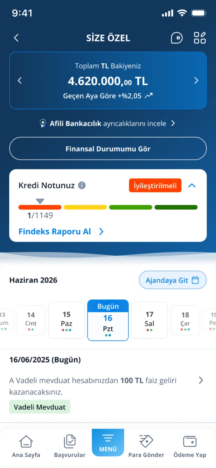
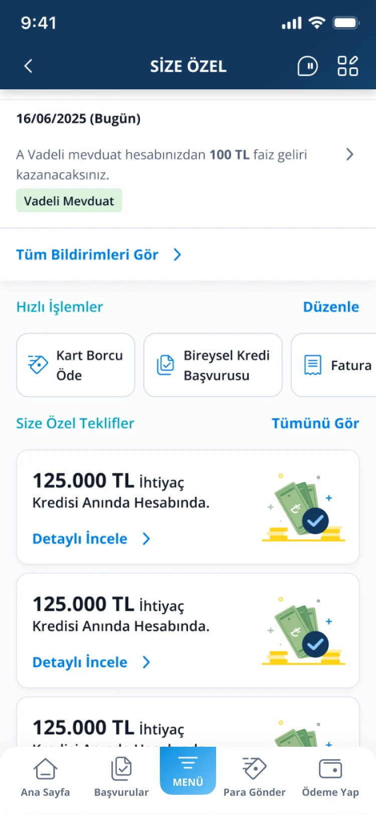
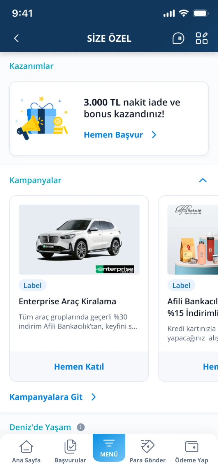
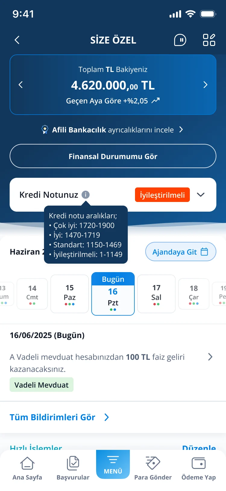
Size Özel shows each customer their own financial picture and relevant next steps on one screen. Personal content comes first; offers come last.
Financial snapshot
Total balance with monthly change, and credit score on a simple color scale with a plain-language status.
Financial calendar
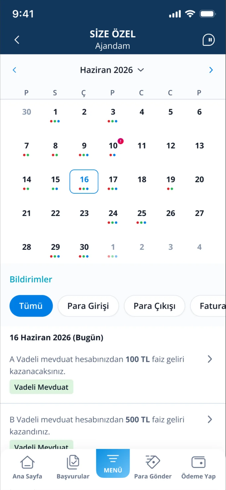
A weekly strip that marks days with money events, like interest earned.
Editable quick actions
Customers search, add and reorder their shortcuts, introduced with a one-time coachmark.
Personal offers last
Loan offers, cashback and campaigns come after personal content, so they feel relevant, not pushy.
Size Özel · Going deeper
Every block opens a focused view.
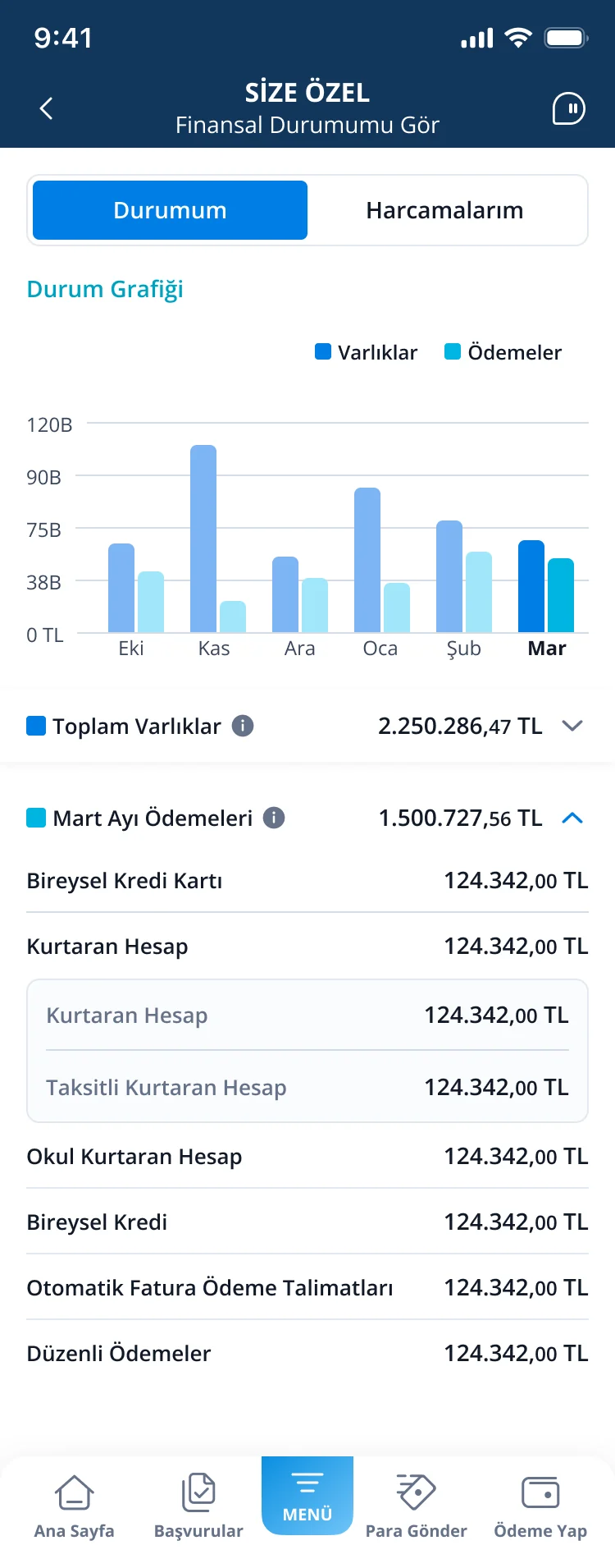
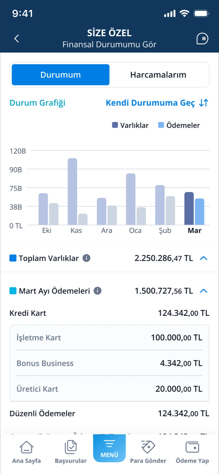
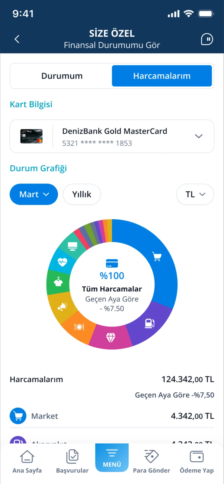
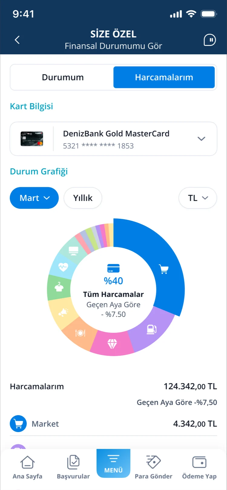
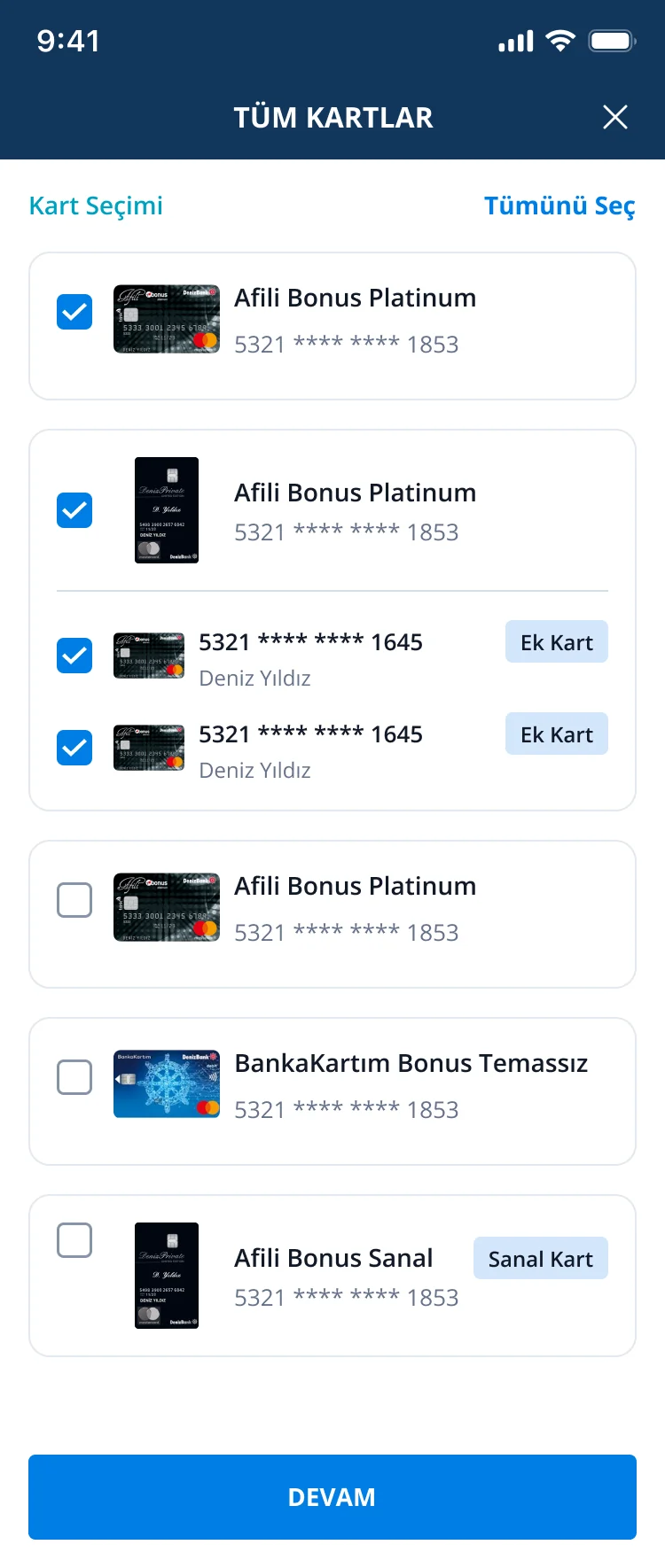
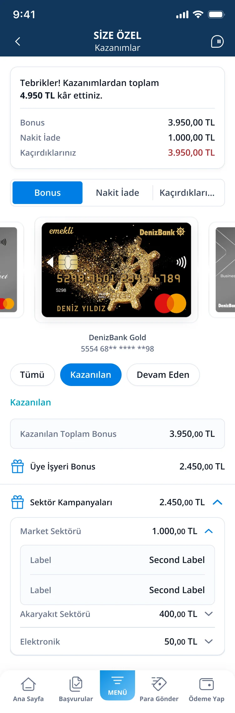
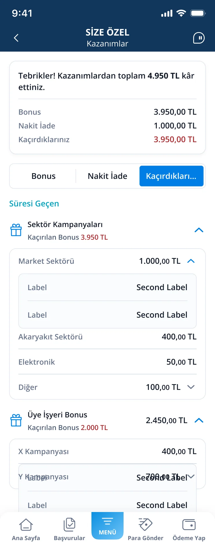
Each block on the home screen opens a focused view: the credit score explained, a full calendar of money events, financial status and spending over time, and what you’ve earned (or missed) in bonuses and cashback.
Deniz’de Yaşam · Smart entry cards
Cards that change with the customer.
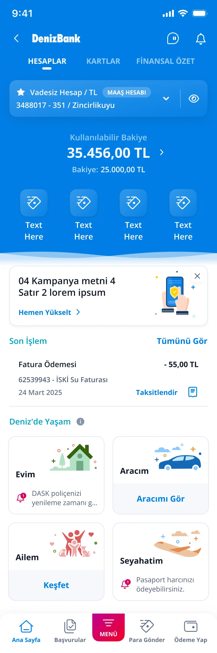
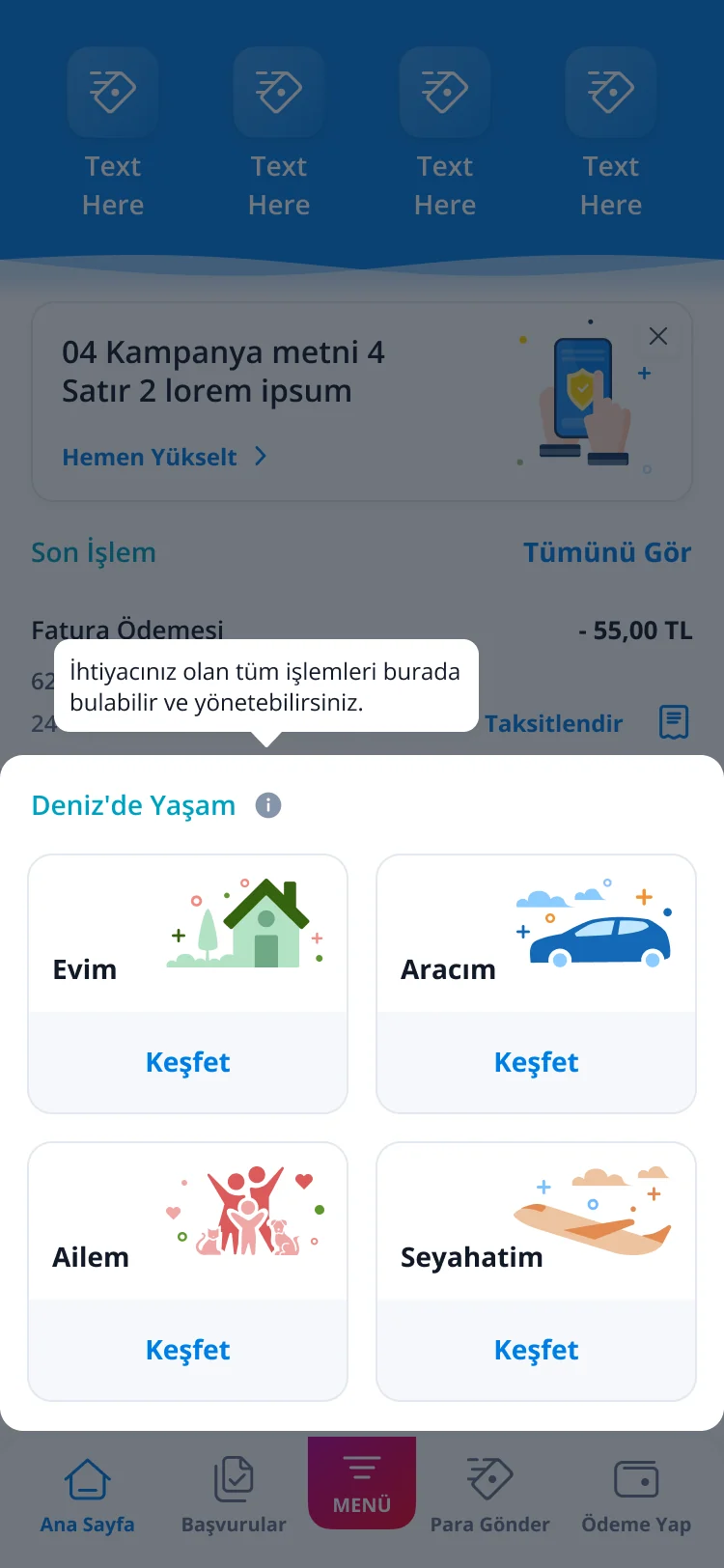
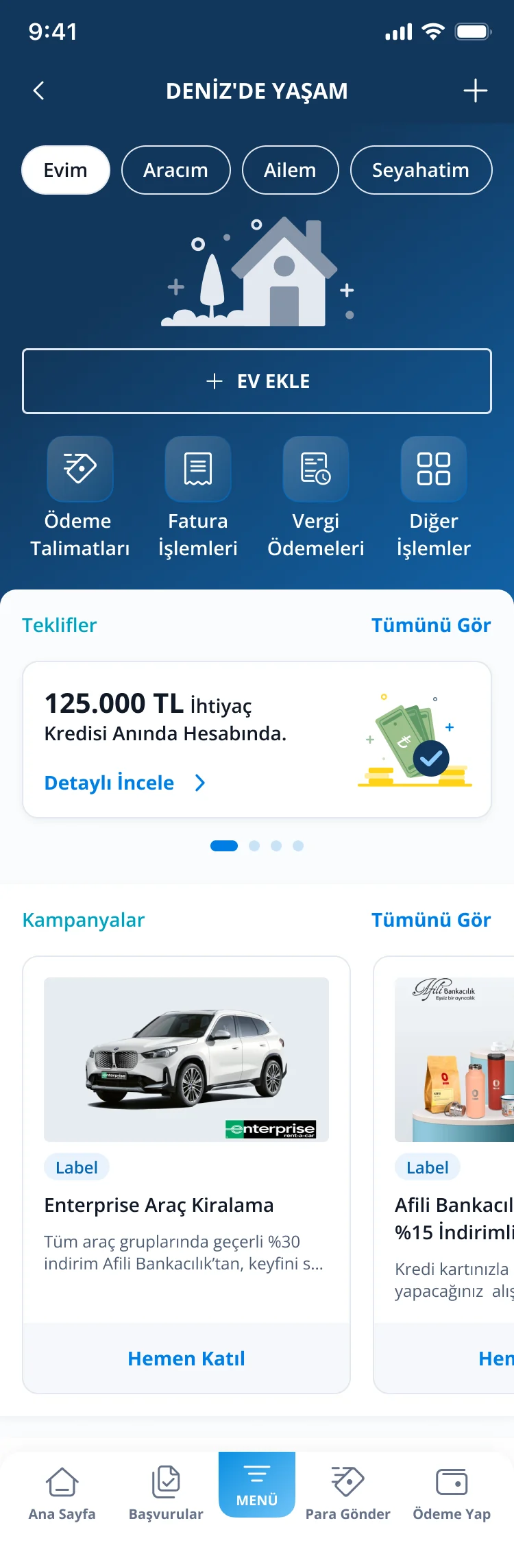
Each area’s card changes with the customer’s state: “Discover” when it’s empty, “See my car” when it’s set up, and a reminder when something is due. A one-time tooltip explains what lives inside the hub.
Deniz’de Yaşam · The hub
One hub, four areas.
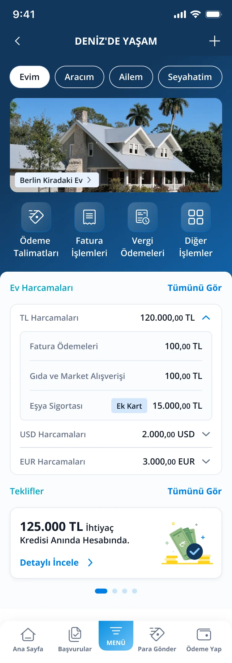
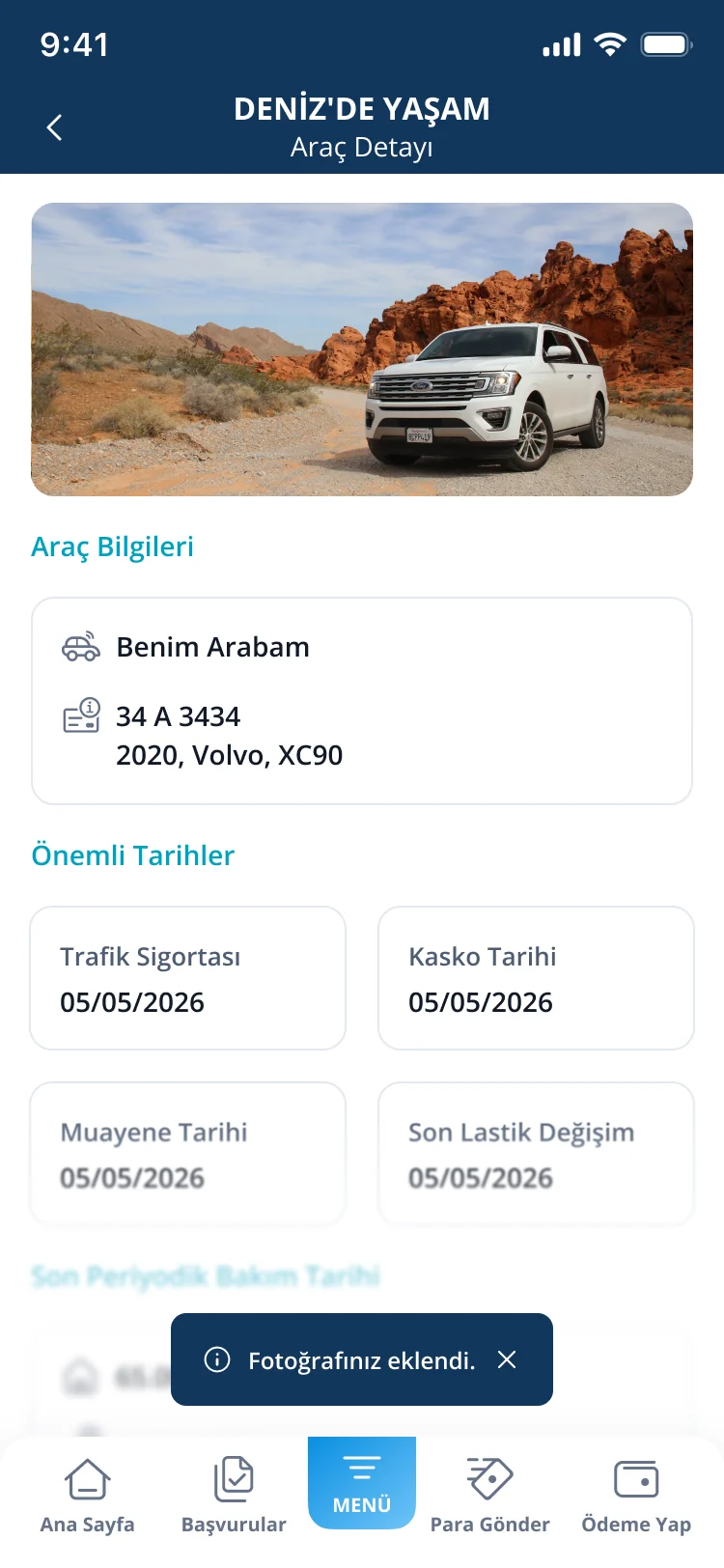
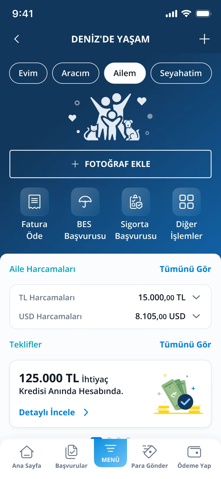
Pill tabs switch between Home, Car, Family and Travel. Each area has its own quick actions, an expandable monthly cost summary, and alerts before insurance or other dates expire.
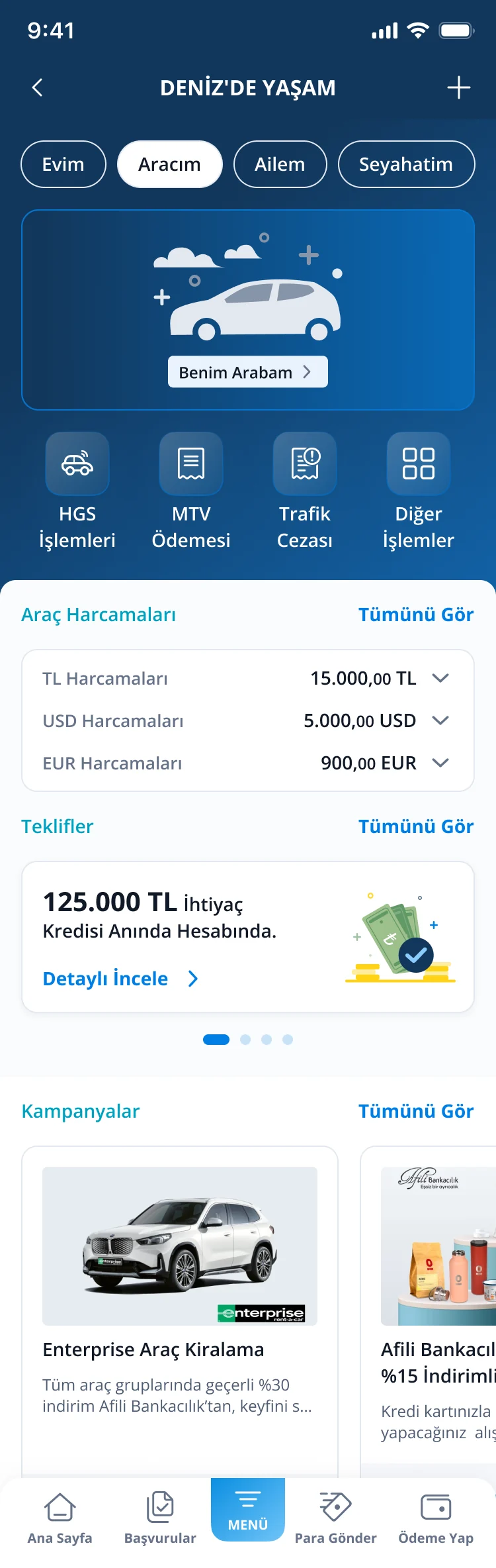
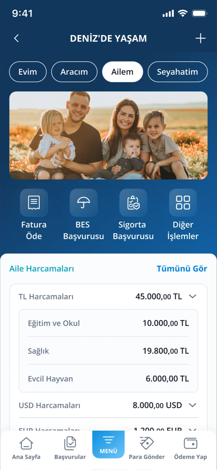
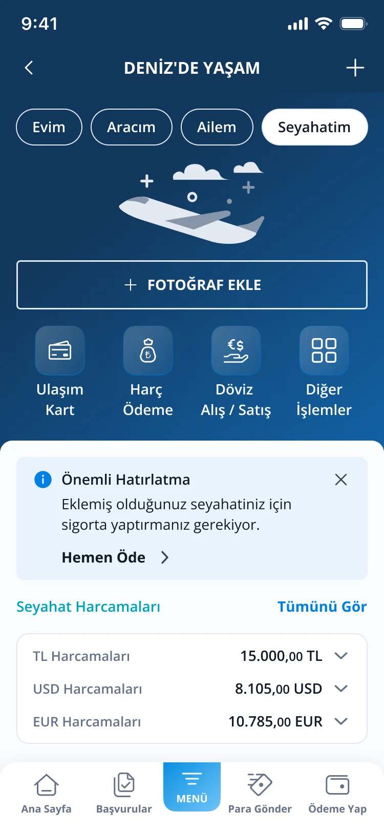
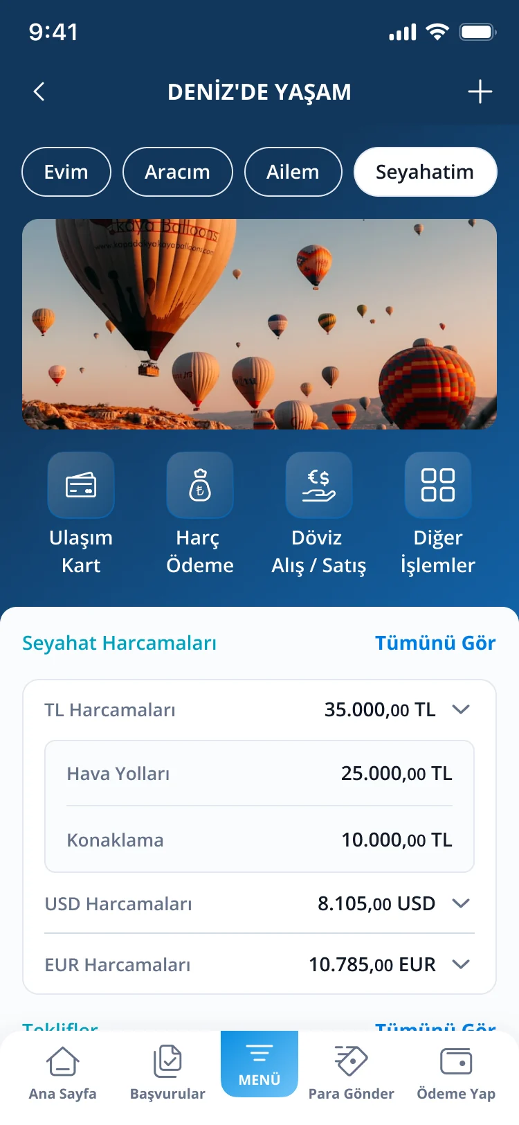
Deniz’de Yaşam · Every state
From empty to set up.
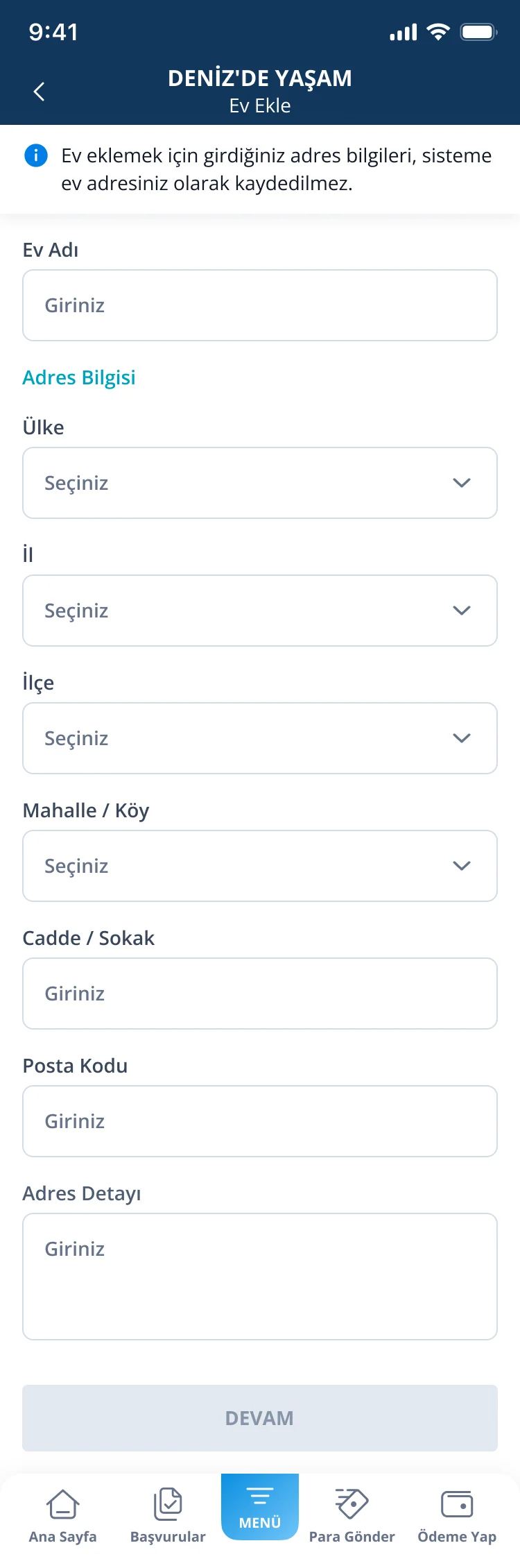
Every state is designed: empty states that invite the first step, forms that collect the dates reminders depend on, and detail views that keep it all in one place.
Design system
One component family, ready for handoff.
One component family
Both features share one reusable “ForYou” component family built with slots.
Every state covered
Empty states, alerts, bottom sheets and a safe “remove” confirmation where Cancel is the primary action.
Ready for handoff
Every state is documented with developer notes.