Commencis · Bank of Trust
A banking app that brings fiat and crypto together
An end-to-end case study for a mobile bank that merges everyday banking with crypto — from research and flows to a token-based, accessible design system.
Overview
One app for everyday banking and crypto.
Bank of Trust wanted a mobile banking app for tech-savvy users aged 20–40, with a youthful, dynamic feel. Reading the brief, I saw a product that could be both digital bank and crypto wallet — closer to Revolut than to a traditional bank — with Google Pay and Apple Pay support for users in Europe and the US, where mobile payments are the norm.
Business goals
- Attract tech-savvy users with seamless fiat and crypto banking.
- Keep users active inside one all-in-one platform.
- Be secure and transparent — a trusted home for digital assets.
- Appeal to traditional banking customers and crypto investors alike.
User goals
- See and manage every bank and crypto account in one place.
- Understand portfolio performance at a glance.
- Feel safe, with security that doesn’t get in the way.
- A modern, intuitive, hassle-free banking app.
Research
Few apps get banking and crypto right together.
I started with a moodboard. Analysing banking and crypto apps, I found only five that combined both well. I studied their flows and design language on Mobbin and Page Flows, then gathered UI, layout and colour inspiration from Behance, Pinterest and Dribbble.

Moodboard
Wireframes
Sketch fast, decide early.
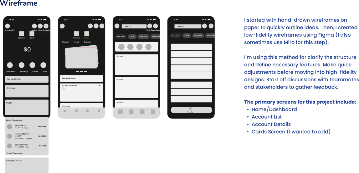
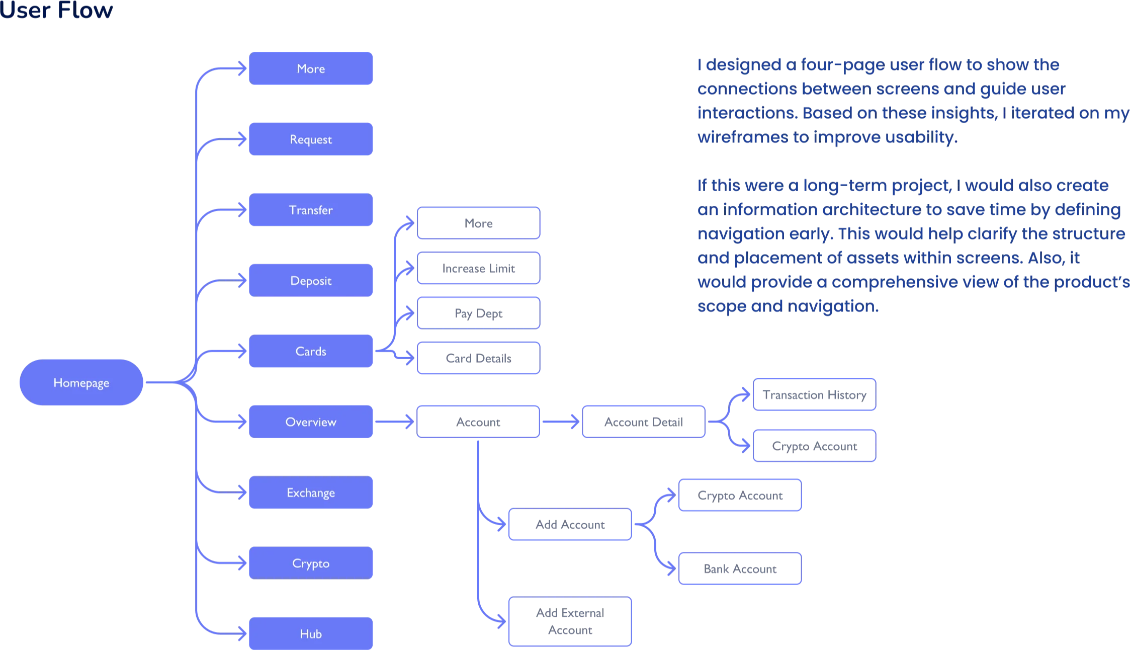
Hand-drawn wireframes on paper let me outline ideas quickly; low-fidelity Figma wireframes then clarified structure and features before any high-fidelity work, and gave teammates and stakeholders something concrete to react to.
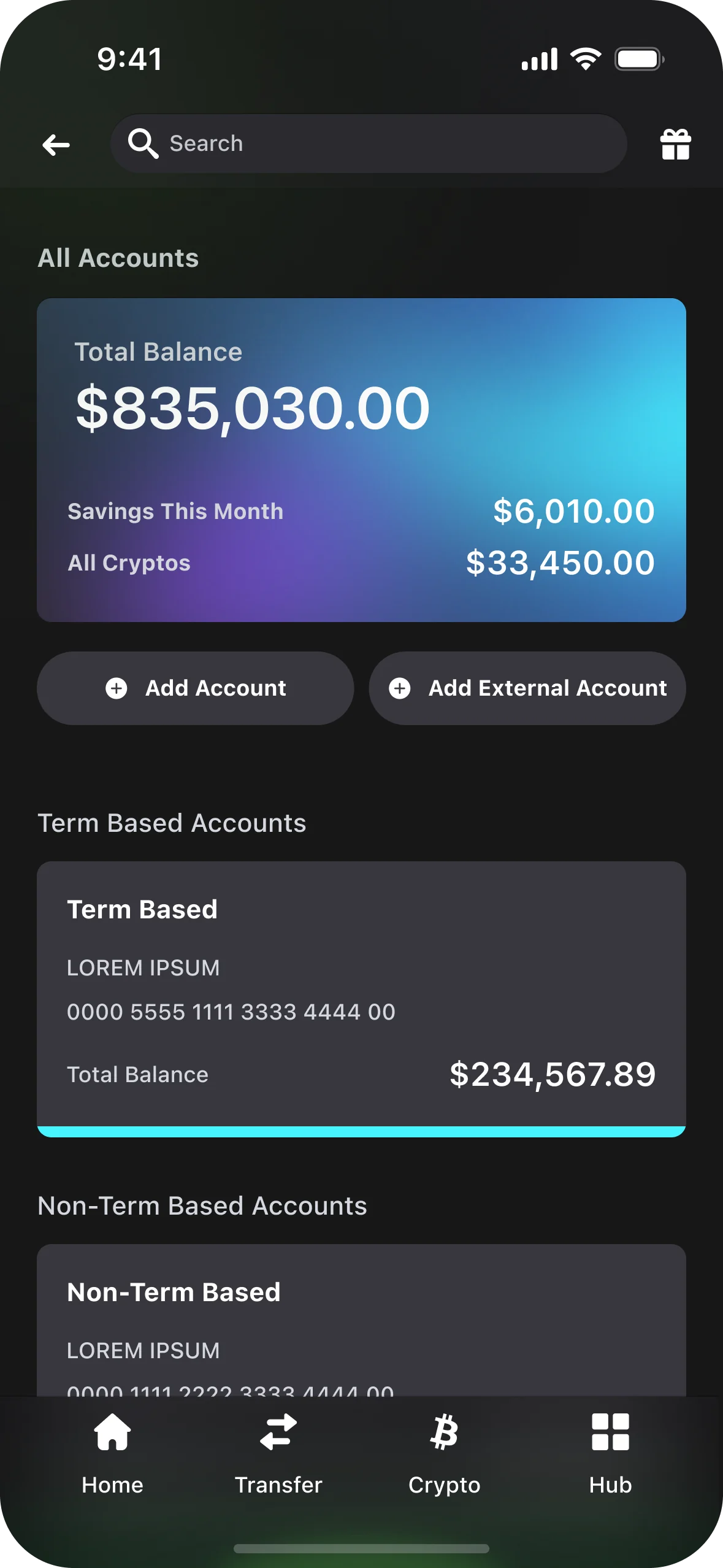
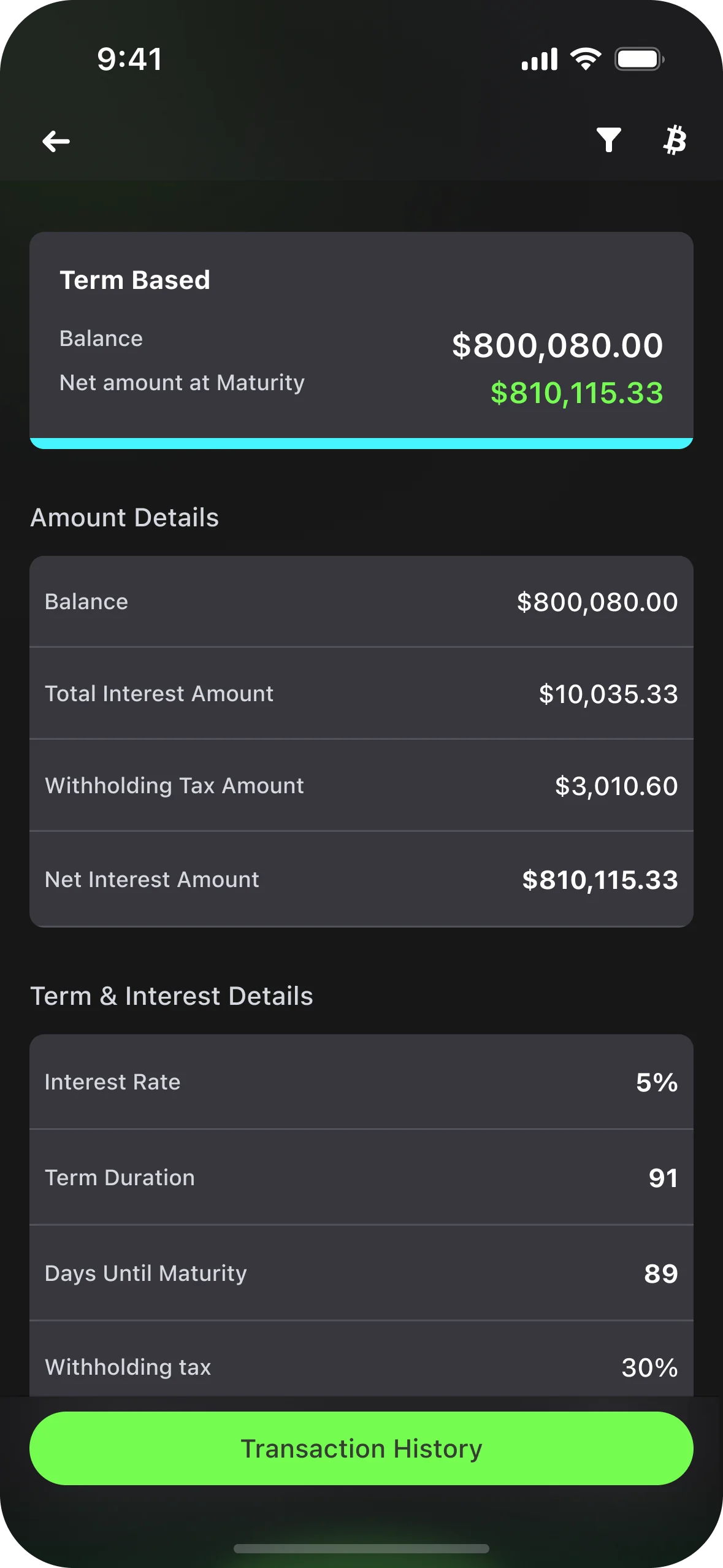
The primary screens: Home/Dashboard, Account List, Account Details — and a Cards screen I chose to add.
Persona & journey
Alice wants everything at a glance.
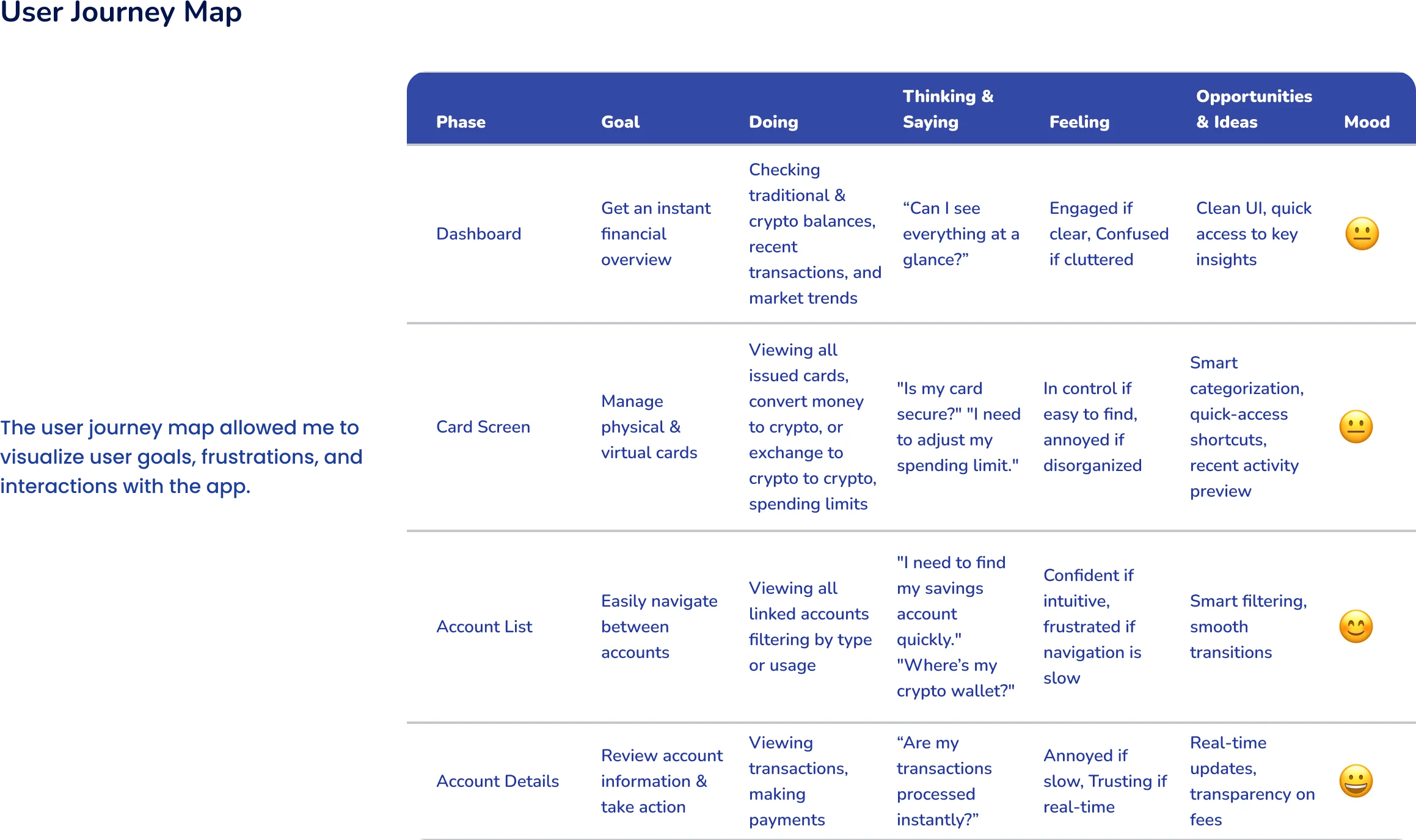
Alice, 33, is a software engineer in San Francisco who uses fiat and crypto for savings, investments and daily spending. She’s frustrated by switching between apps, high conversion fees and clunky, outdated banking interfaces.
Mapping her journey across Dashboard, Cards, Account List and Account Details showed where clarity and speed decide whether she feels in control — or confused.

Design system
Dark surfaces, neon green, built on tokens.
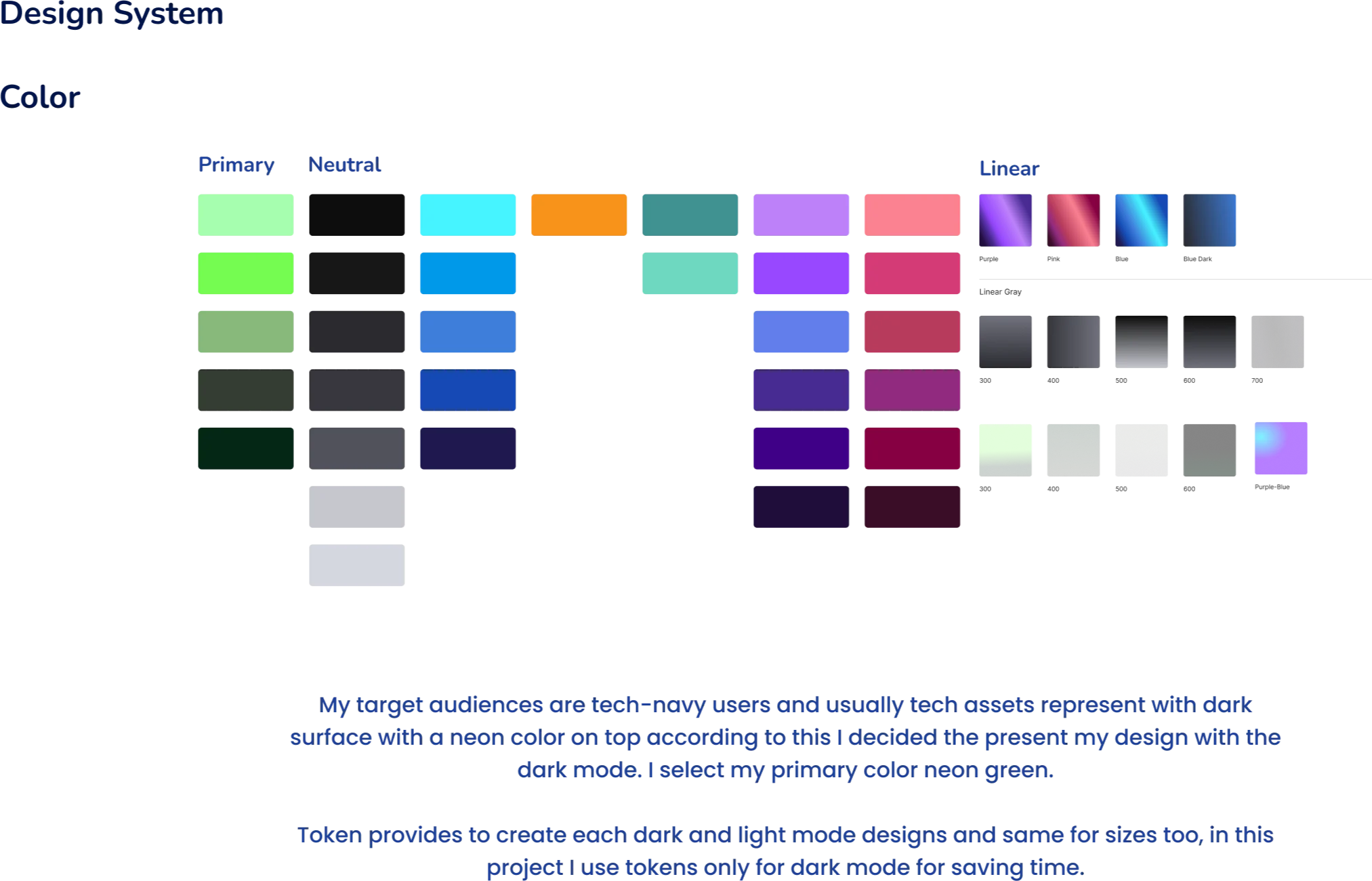
Tech audiences associate digital assets with dark surfaces and neon accents, so the app is designed dark-first with a neon-green primary. Tokens are organised as primitive, semantic and responsive, ready for light mode and multiple sizes.
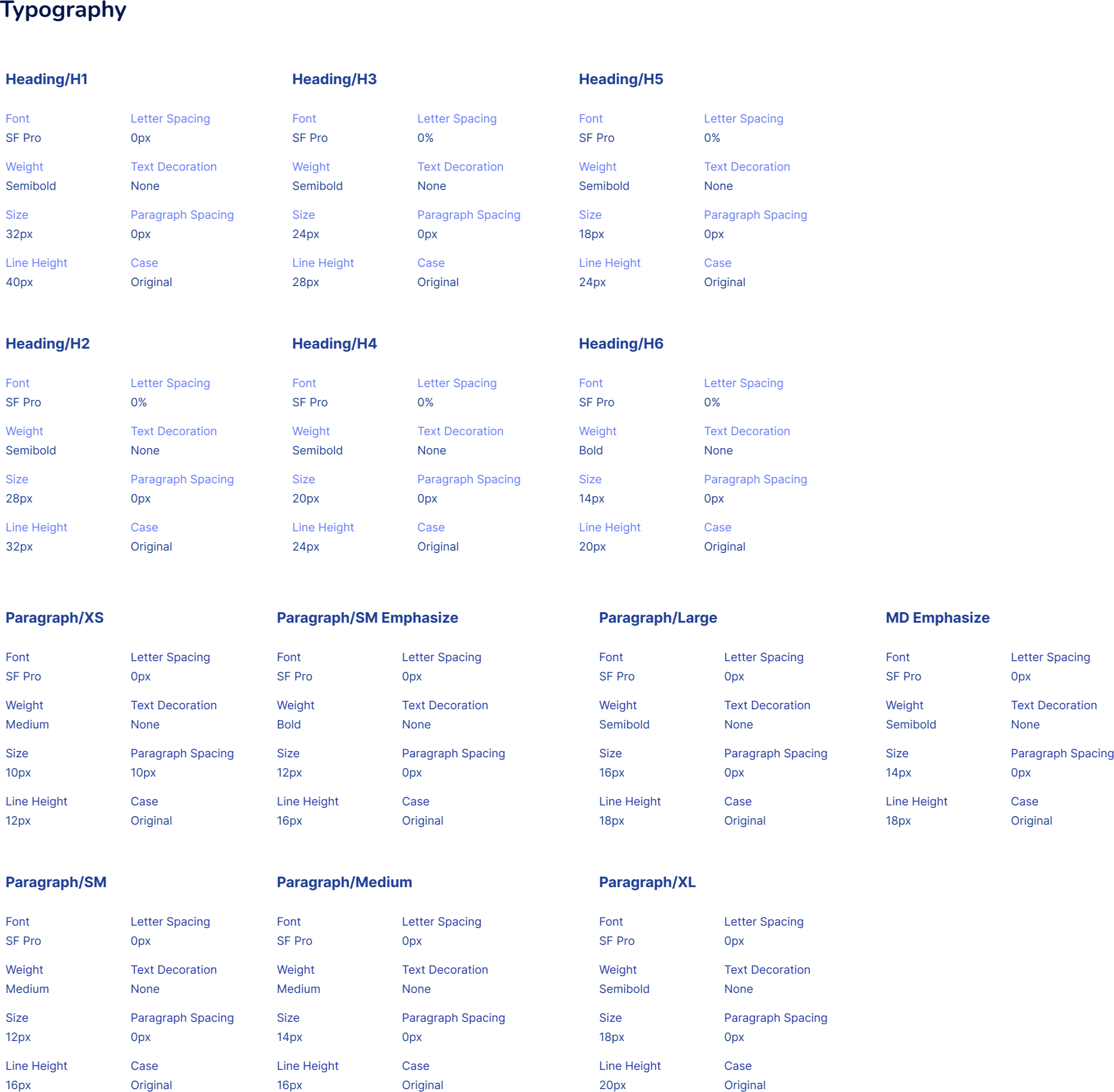
Typography uses SF Pro on a 393 × 852 iPhone canvas with a 4-column grid, 16px gutters and margins.
Components
Built atom by atom.
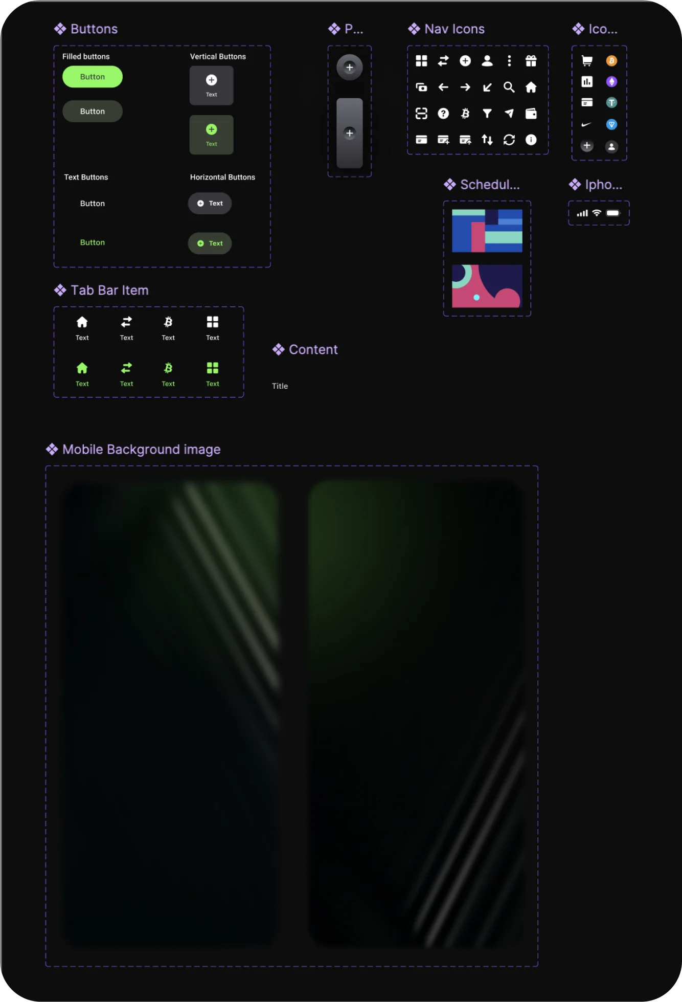
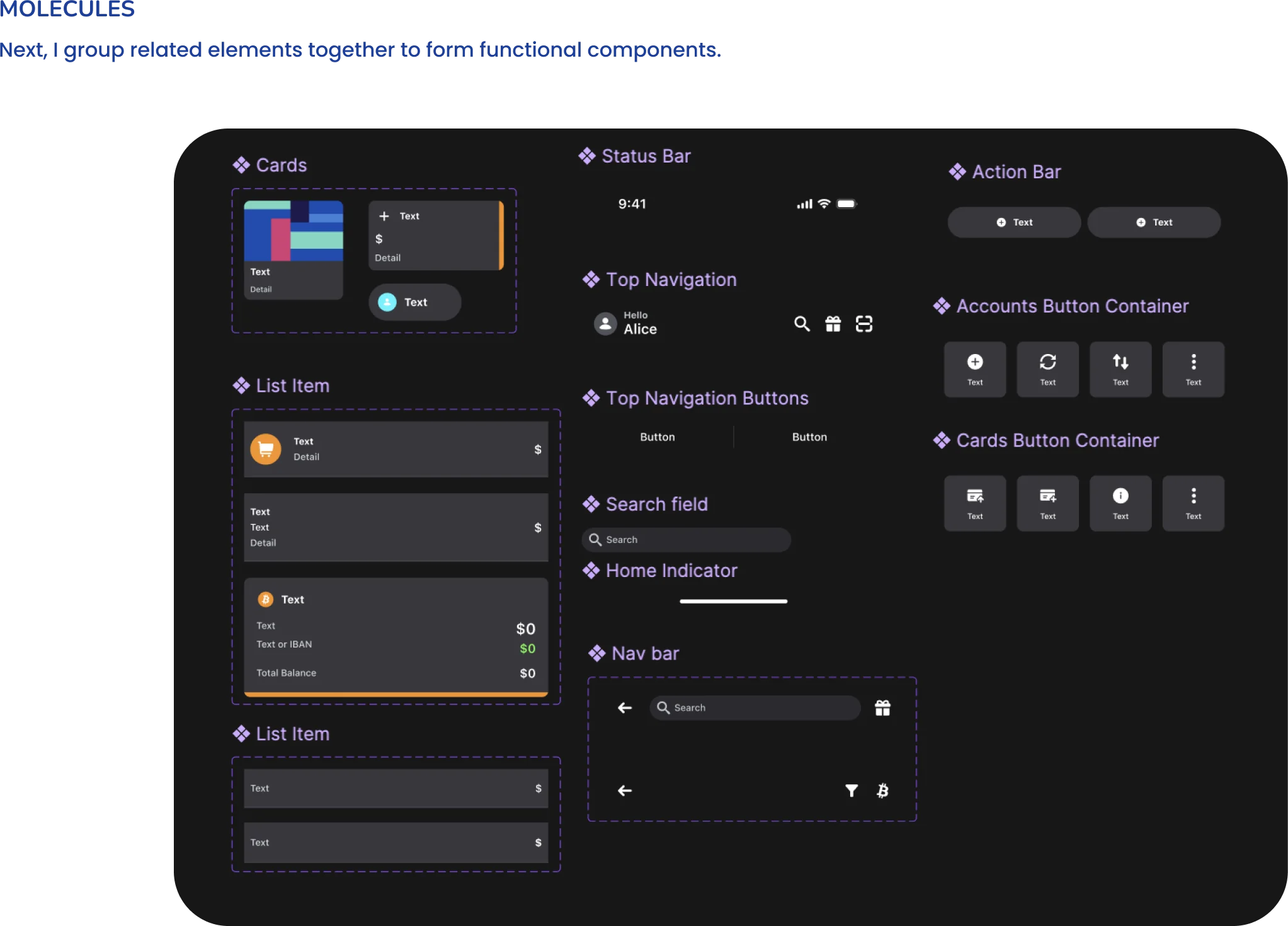
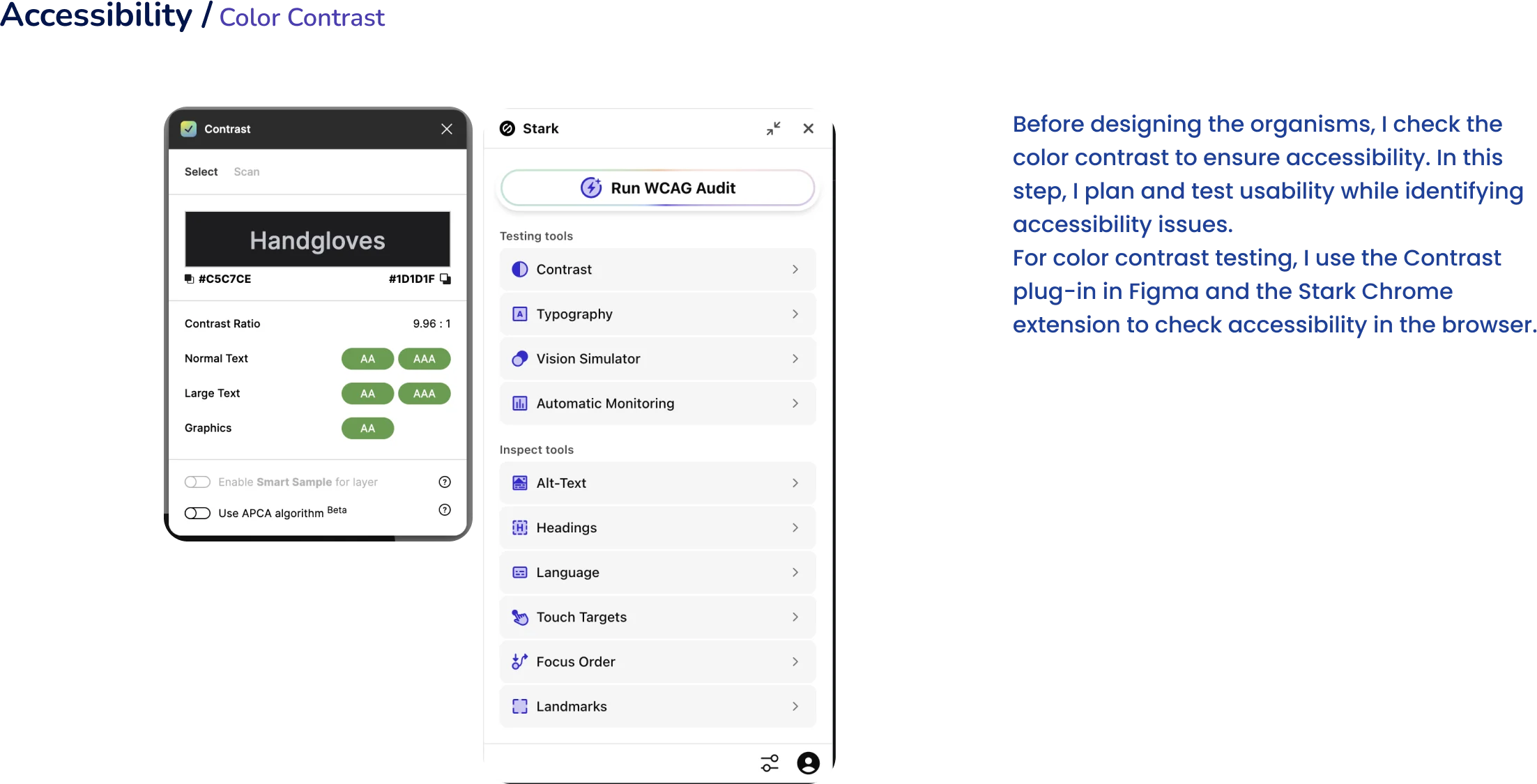
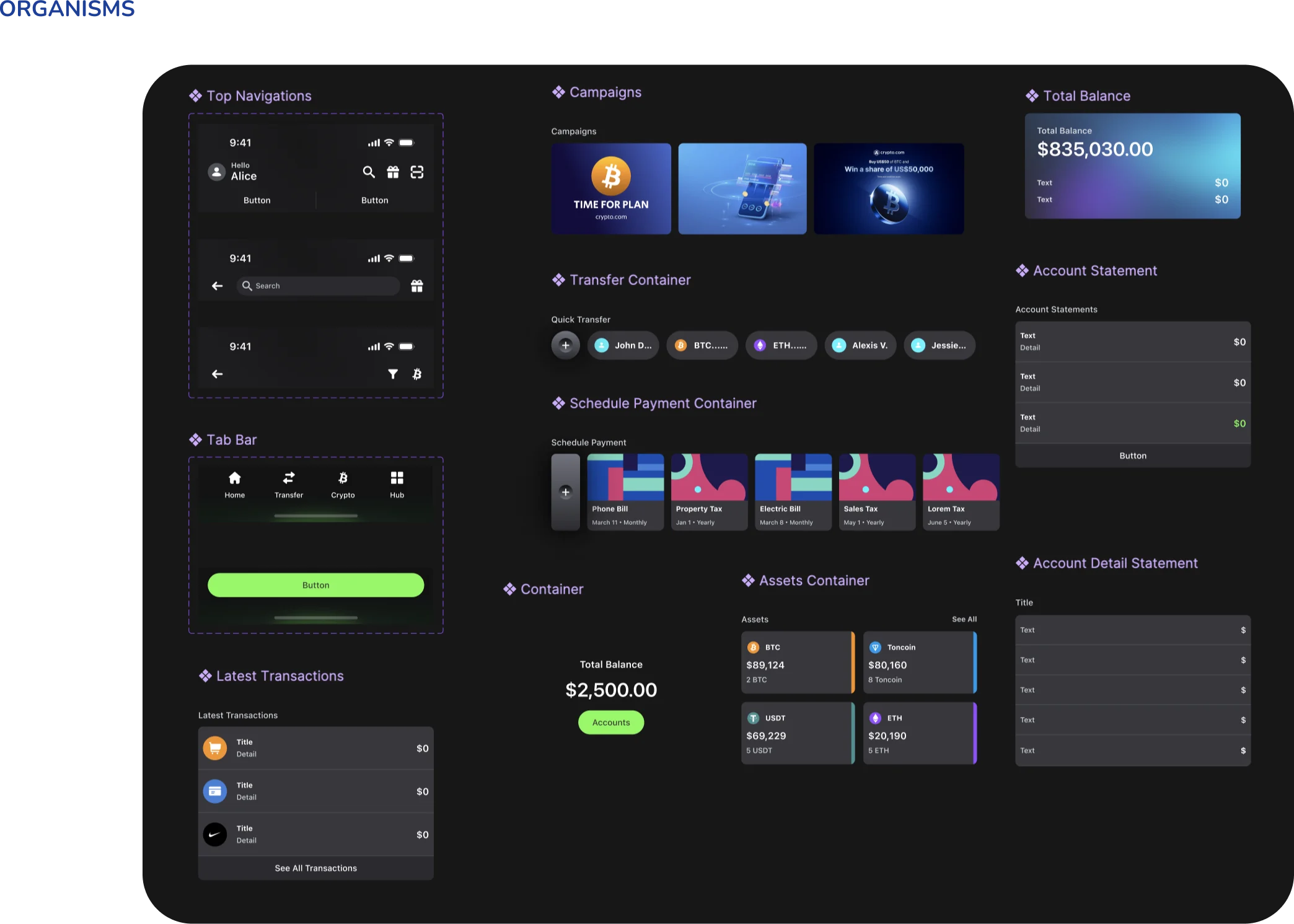
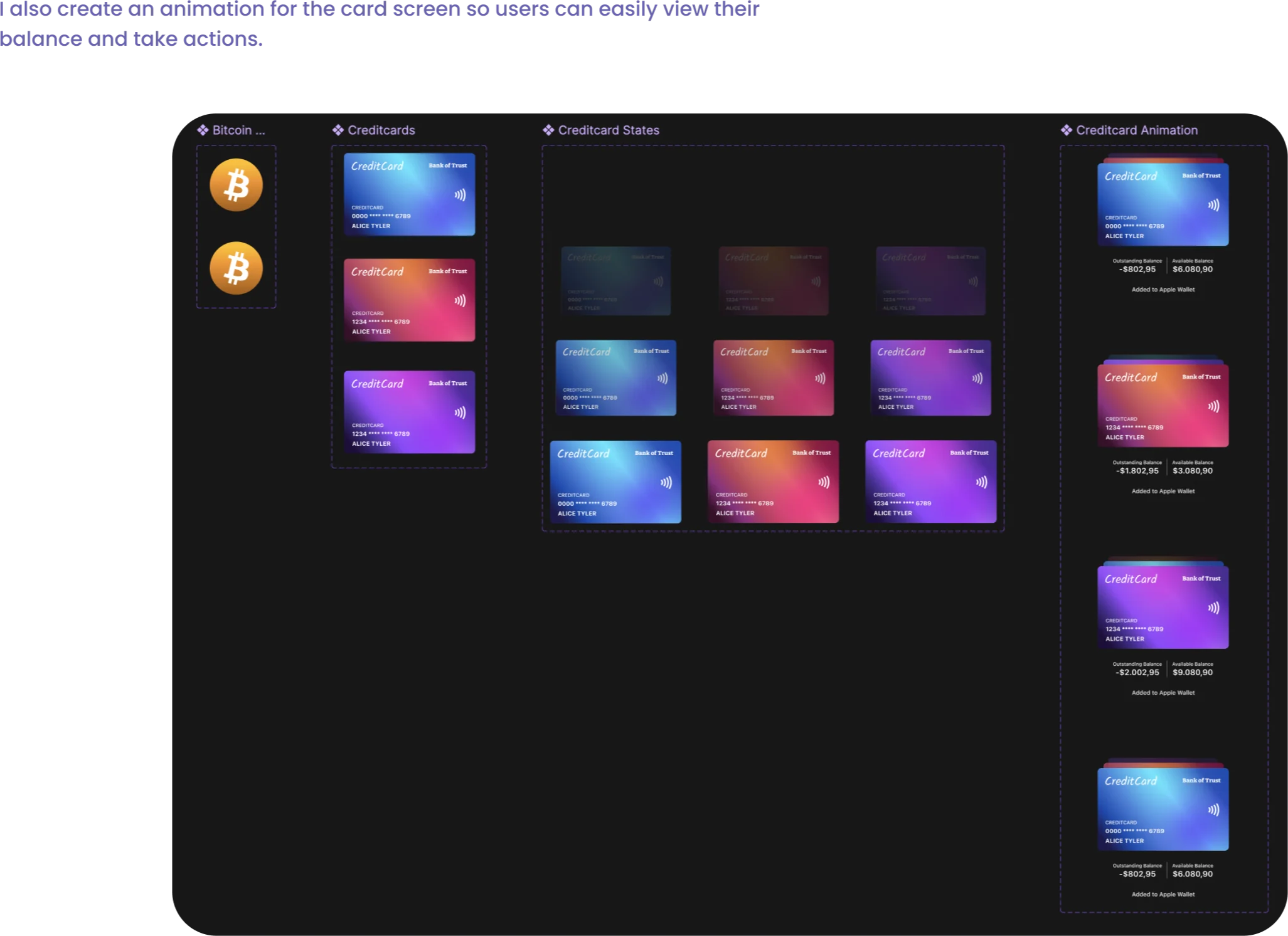
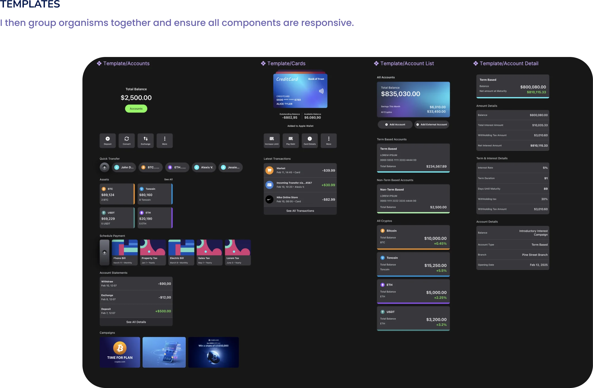
I used atomic design: buttons and icons first, then molecules such as cards, list items and navigation, then organisms like balances, transfers and schedules — all checked for colour contrast with the Contrast plug-in and Stark before going further.
Final design
Four screens, one calm system.
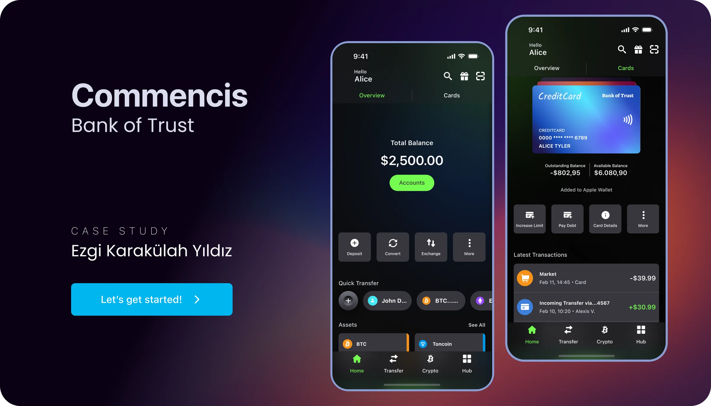
The finished pages turn the templates into a dark, focused banking experience: an instant overview on Home, cards you can flip through, accounts filtered by type, and real-time detail for every account.
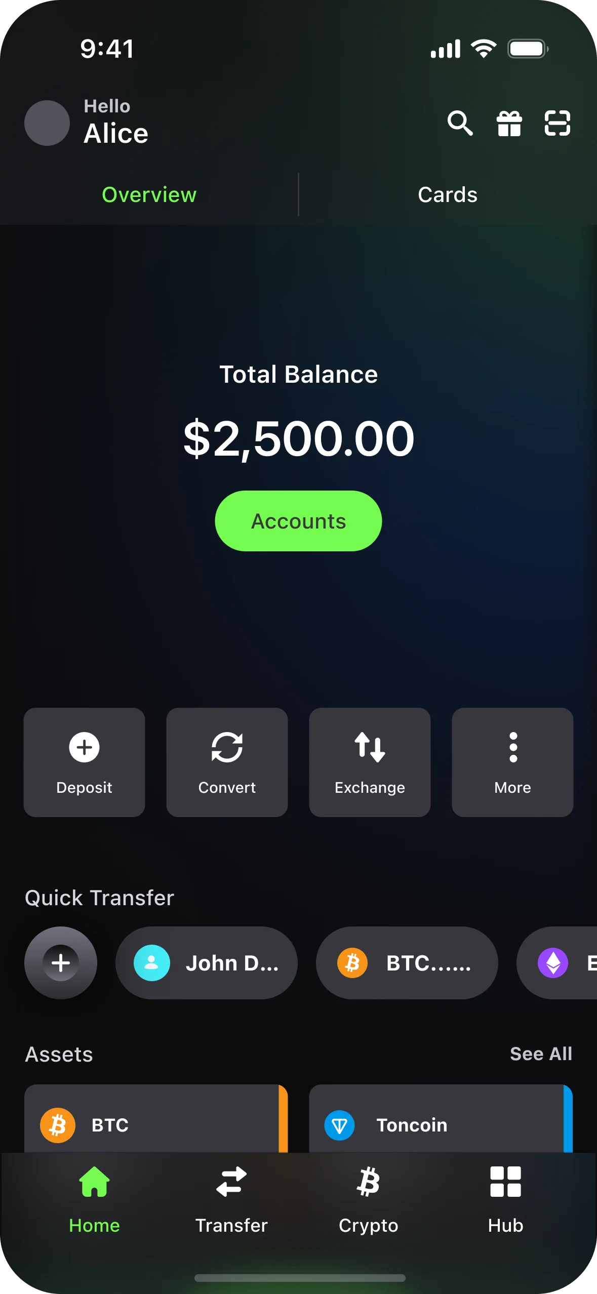
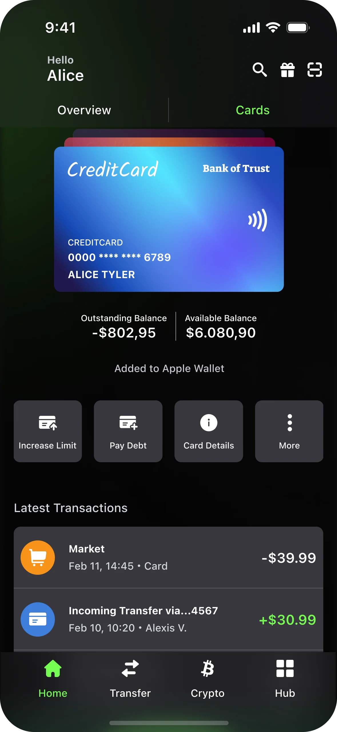
Home · Cards · Accounts · Account detail