
Lyrebird · Cosmo
Fixing the friction in an AI face & body editor
A 7-day UX audit and redesign: competitive research, a persona and empathy map, eleven pain points — and a clearer app built around them.

Overview
A fast-growing AI app with growing pains.
Cosmo is a photo editor packed with AI features, and it adds new ones constantly. In a 7-day sprint for Lyrebird I reviewed its UX, researched competitors and solved its most important problem through conceptual design — simplifying navigation, improving onboarding and making features easier to find.
Success is measured through engagement and user feedback, with a post-release plan for continuous iteration.
Research
Cosmo next to Facetune, FaceApp and Remini.
I mapped Cosmo’s screens alongside three competitors with sticky notes for new ideas, positives, pain points and differences, then compared features side by side. Cosmo lagged on ease of use, background editing, a web presence and free AI features.


Persona
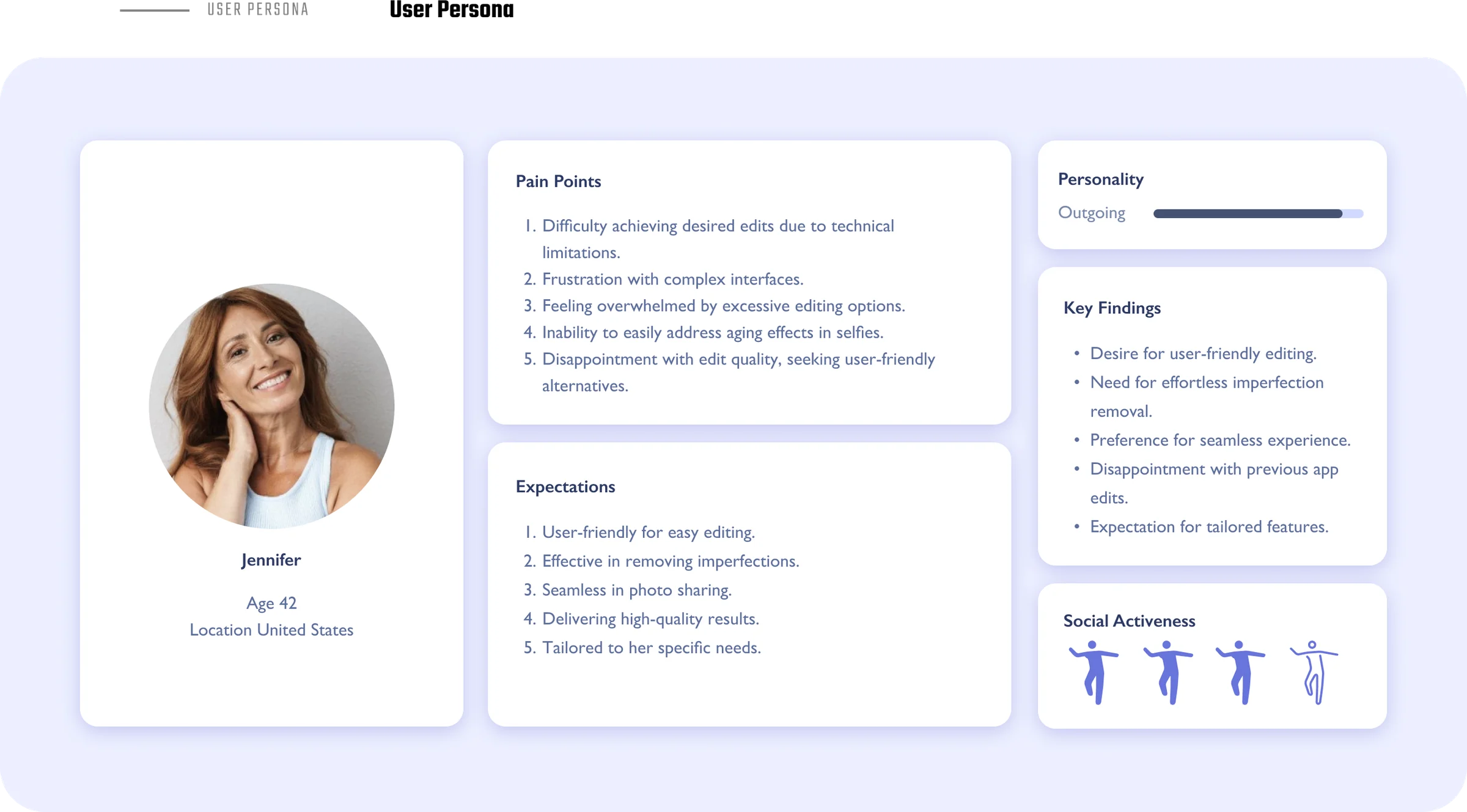
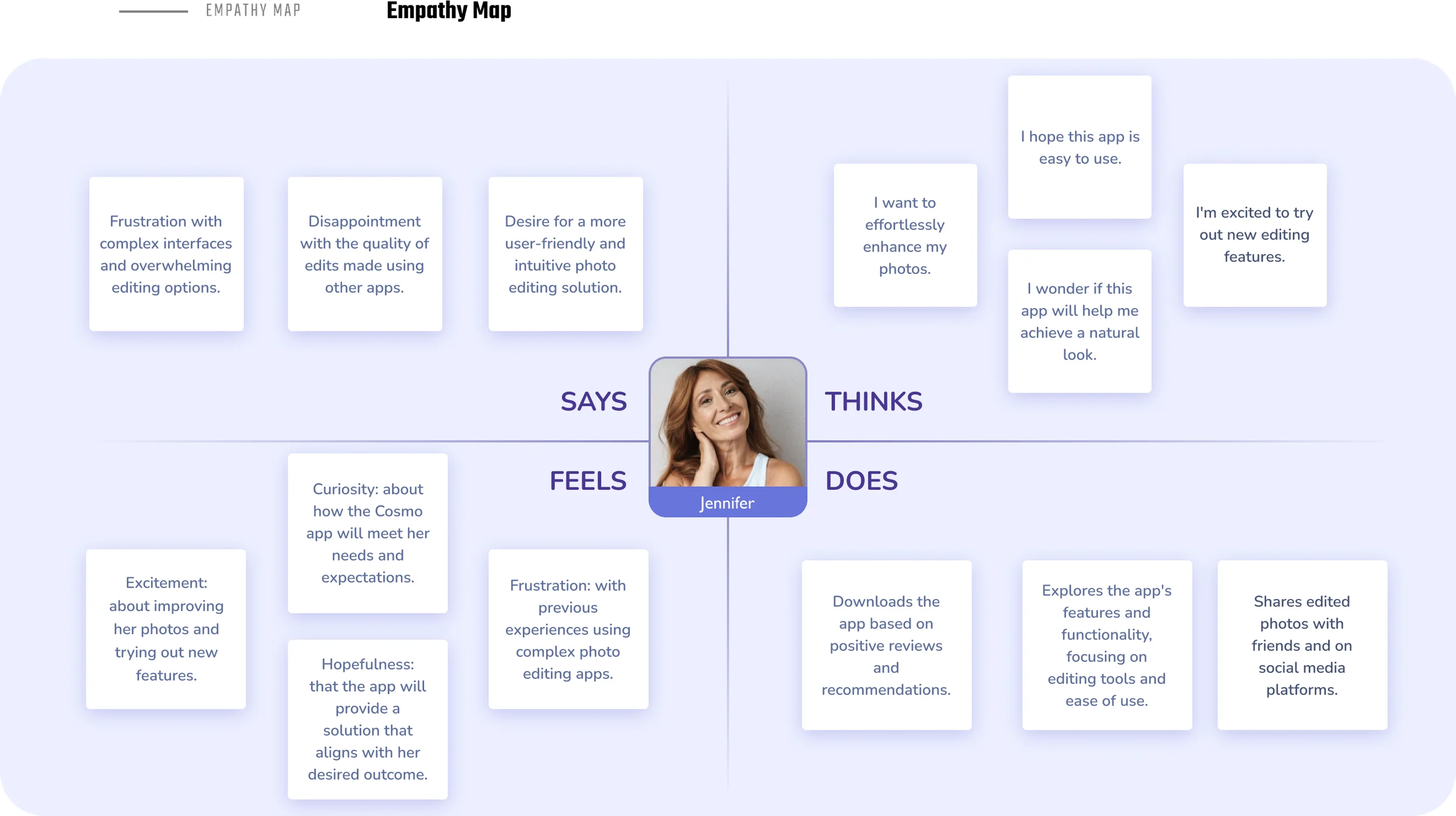
Jennifer wants a natural look, without the fuss.
Jennifer, 42, is outgoing and active on social media. She wants effortless, high-quality edits but feels overwhelmed by complex interfaces and too many options.
Key findings
Small inconsistencies, big confusion.
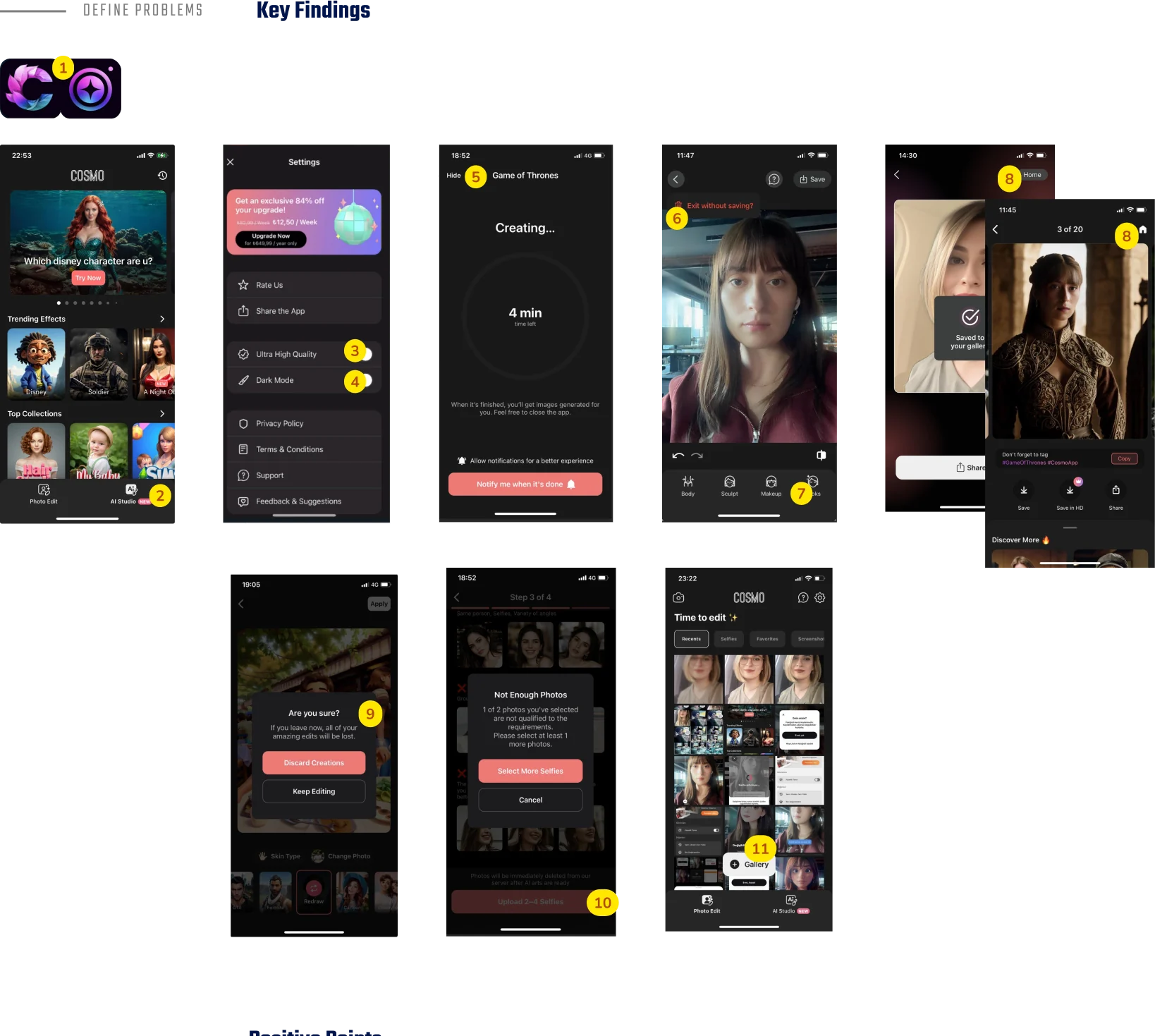
People loved discovering new filters, and the Photo Edit screen was clear. But the audit surfaced eleven issues — among them:
- The app logo didn’t match the App Store icon.
- It was unclear whether you were on the homepage or in AI Studio.
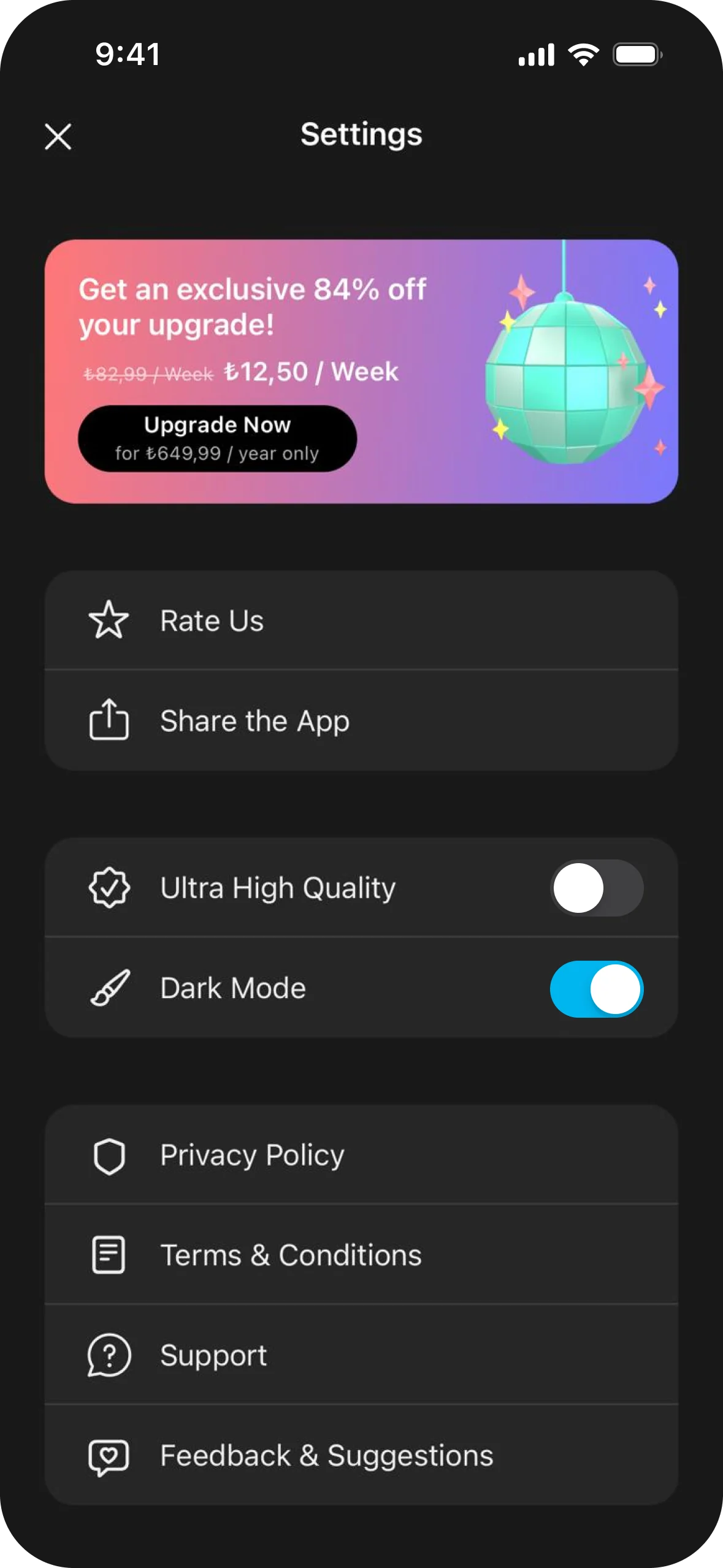
- Toggle states were hard to read, especially in dark mode.
- After tapping “Hide” during a generation, finding your way back was hard.
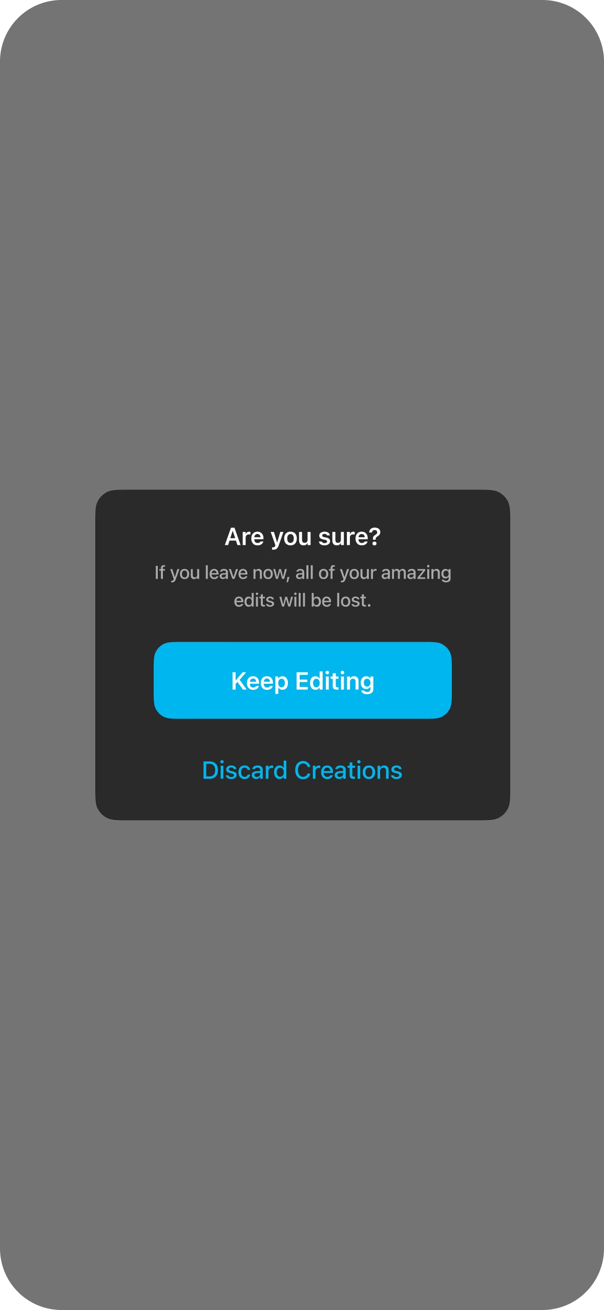
- There was no consistent way home, and modal labels didn’t say what would happen.
Solution
Clear navigation, visible progress.
- Make the logo consistent across the app and the App Store.
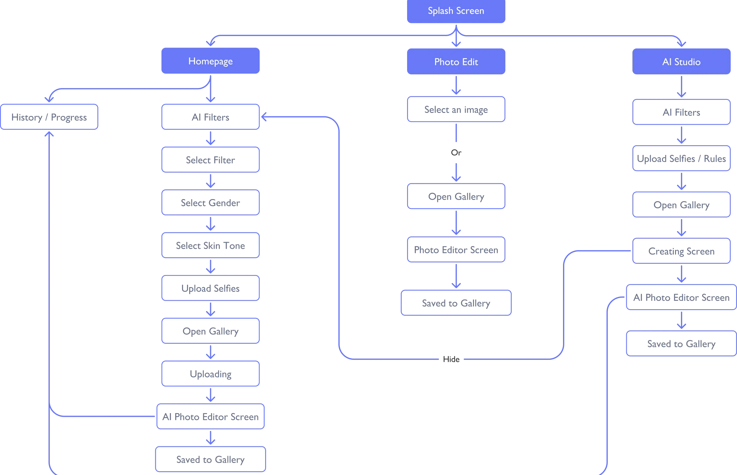
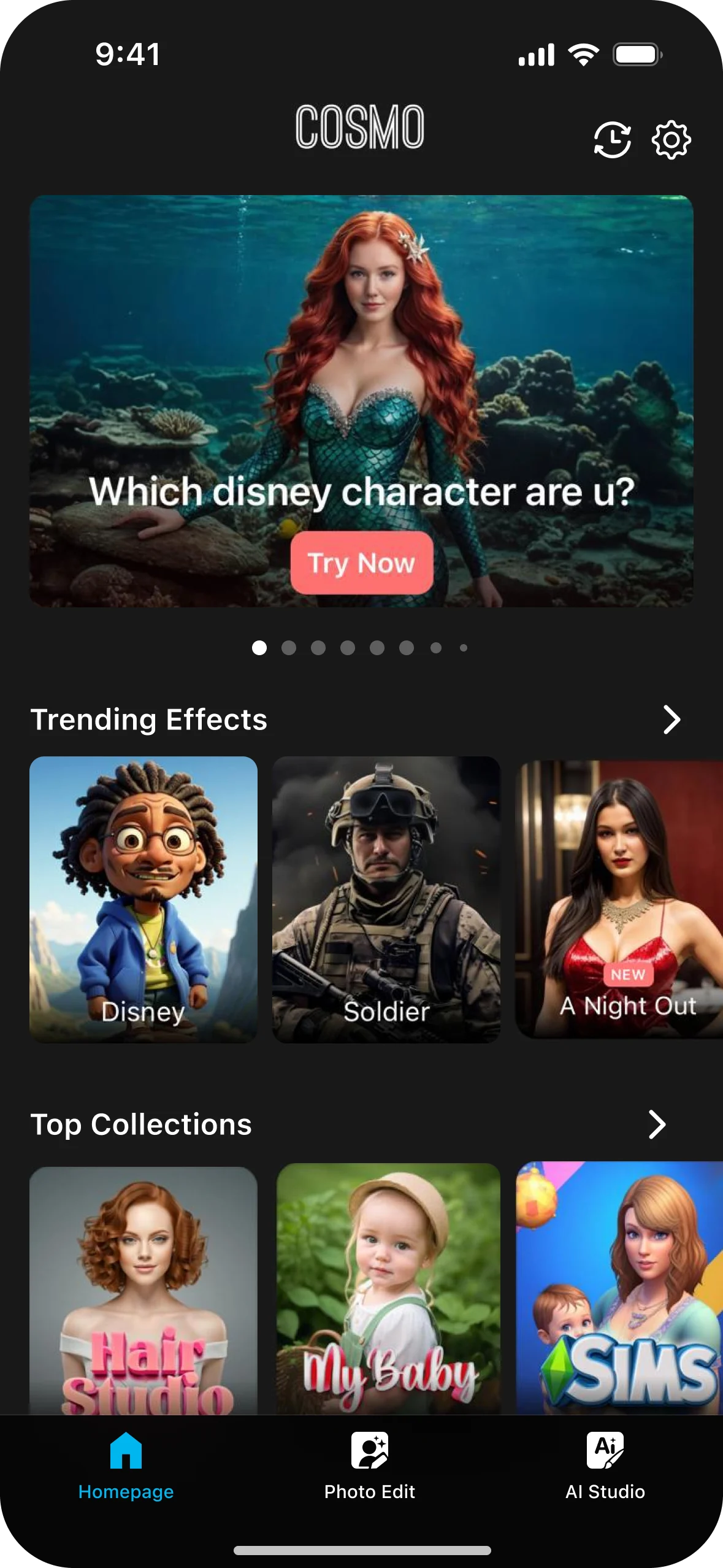
- Add a Homepage tab and move settings to the homepage.
- Give AI Studio its own screen; clarify toggles, icons and buttons.
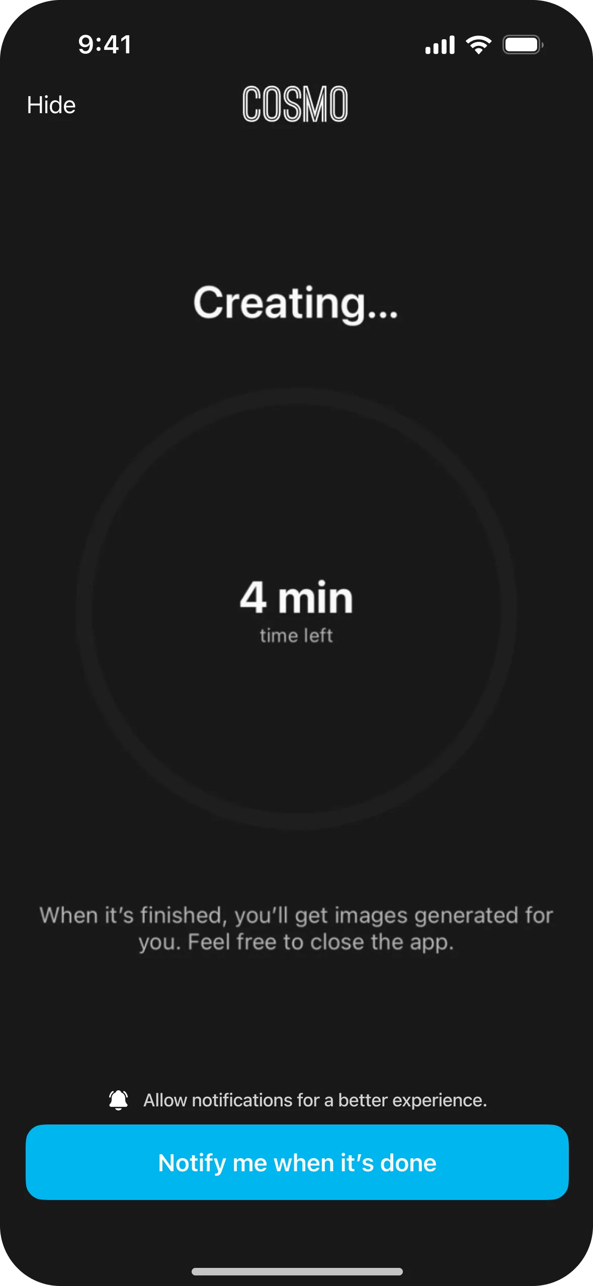
- Show a linear progress bar on the homepage after “Hide”, so people can follow their creation.

Final screens
Every step, redesigned.
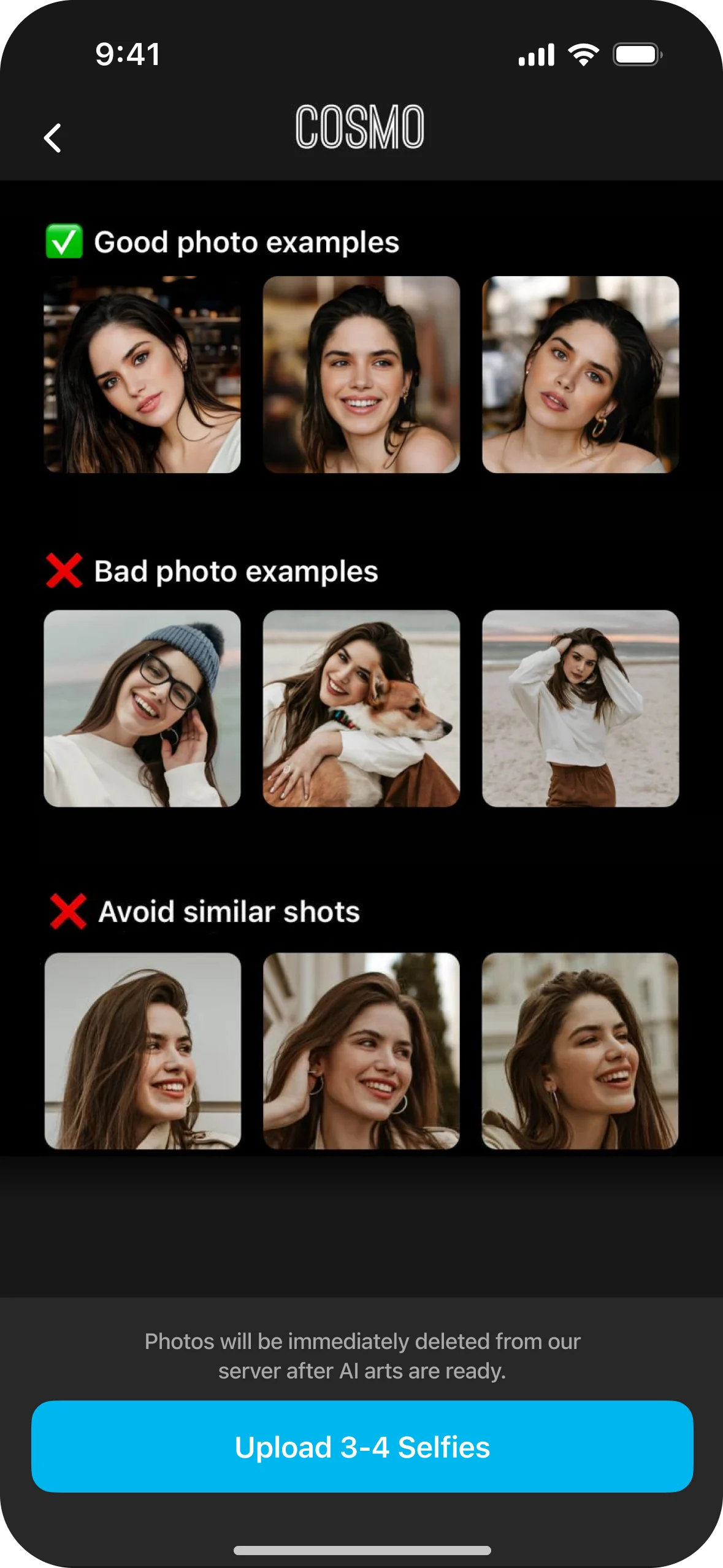
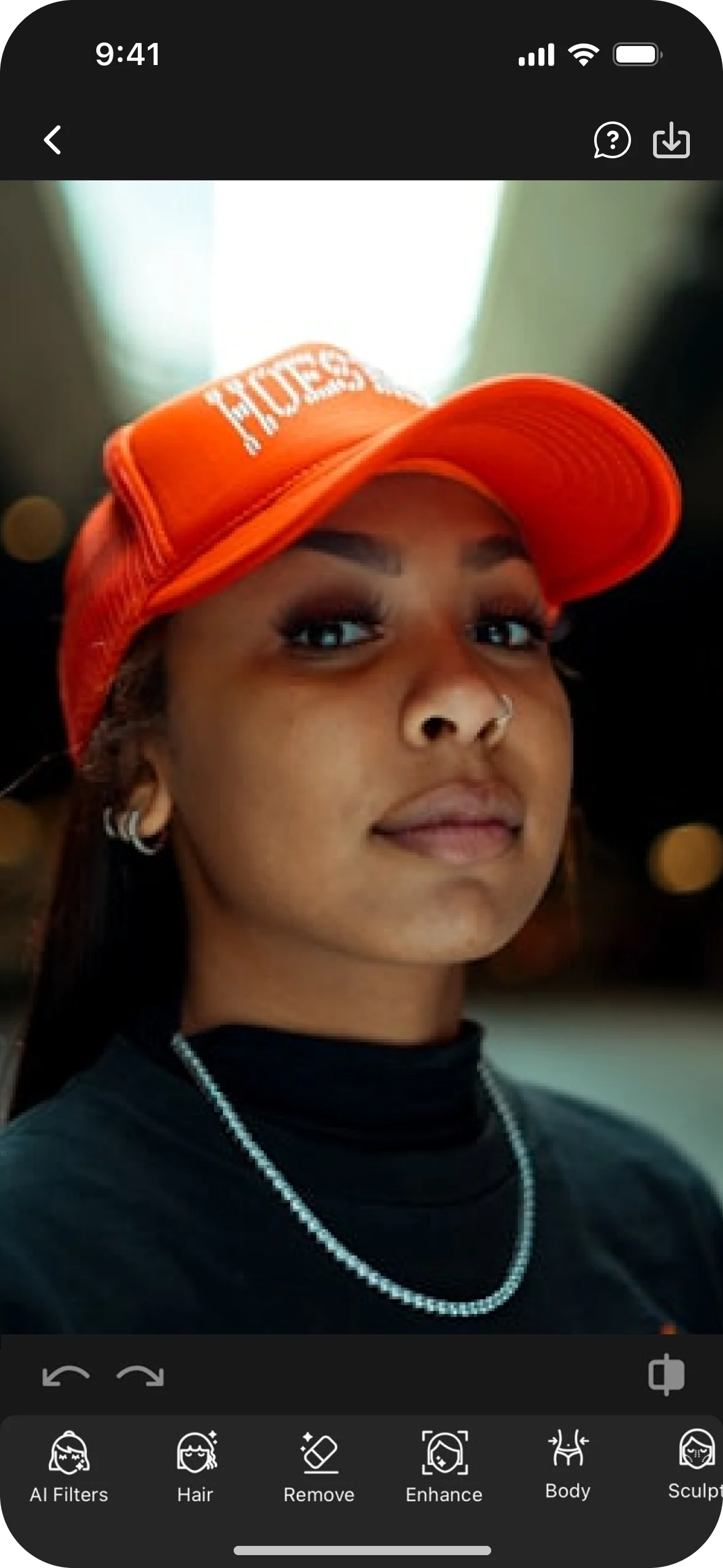
From the new homepage and AI Studio to uploading selfies, creating, and tracking progress from anywhere.





Post-release
Measure, learn, iterate.
- Encourage in-app feedback with rewards, and look for recurring themes.
- Track downloads and engagement with analytics.
- Ship regular updates with fixes and performance improvements.
- Announce improvements through release notes, newsletters and social media.
- Keep running user tests to find strengths and weaknesses.
